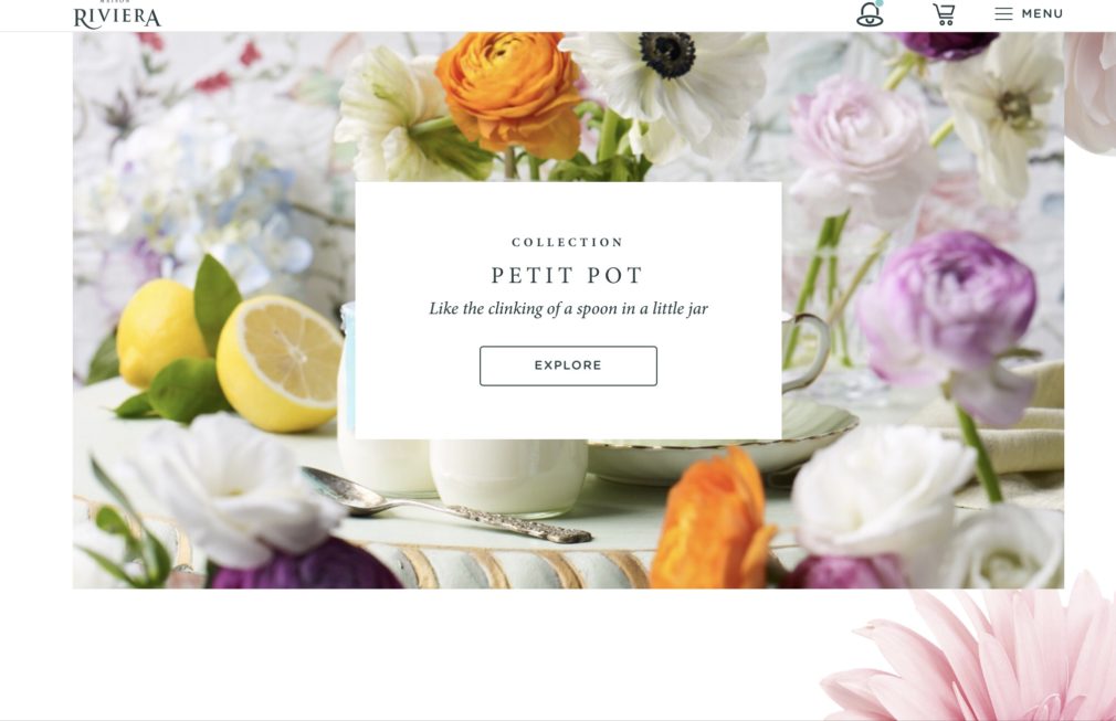
What should I put on my website home page?
When creating the Home page on your website, you will need to remember to write your content in a way that serves the user. Below is an explanation of elements you should – and shouldn’t put on your home page.
- What do you want the the user to do when they come to your website?
- Make the text on your home page visible
- Make your website responsive
- The design of your website exists to support the content
- SEO
- Before you begin the design phase, do the following
- Your home page design
- Make the home page all about the user
- Which features should I place on my home page?
- How do I write an powerful homepage headline?
- Can you give me a formula for writing a great headline?
- Should I put my posts on my homepage?
- Should I include social media on my homepage?
- Should I include a calendar on my homepage?
- Should I include features on my homepage?
- Should I put my face on my homepage?
- Your website is not written in stone
- Let's look at a few examples of great homepage design
- Testimonials on your homepage
- Conclusion
What do you want the the user to do when they come to your website?
Have you ever asked the question: What should I put on my website home page? Before anything else, think about the purpose of your site and your objectives. Do you want to:
- Make sales
- Generate leads
- Book appointments
- Build your reputation
- Describe your expertise
- A combination of the above
Think about the outcome that you want to achieve and then lay out the website to accomplish those goals. To learn how to design your pages, please read How to design your website layout.
Make the text on your home page visible
Many themes come with pale grey text set as a default feature. I’m not sure why this practice ever became popular, since it is almost impossible to read such text. Perhaps developers thought that one should subordinate content to design? That is never the case. Users are coming to your site to get information, instruction, or to buy something. Therefore, they need to be able to read the text.
Older people are the ones who most complain about the light text color. You must keep in mind that The Silent Generation, The Baby Boomers, and Generation X’s have the most money to spend. If you are aiming your goods or services at them, you must create websites that cater to their needs.
Make your website responsive
Choose a theme or page builder that is responsive, that is one which displays well across all devices. Then while creating your design, monitor it each step of the way to make sure it looks and functions as well on a smart phone as it does on a big screen.
The design of your website exists to support the content
In the past the build was the primary concern of the website. With premium themes and page builders, the technical aspect has become much simpler to execute. However, what has become more important is the content. Users are coming to your site to get information, instruction, or to buy something. The quality of information and the overall user experience on your site can propel your website to the first page of search engines, or not. Consequently, your design must support your content.
SEO
On page SEO is critically important to getting traction. How is that achieved? By having well written, and well researched content. As search engines get smarter, they are able to gauge the quality of written and visual content. If you want to rank, a lot of thought has to go into your keyword phrase research, branding, content, and design.
Before you begin the design phase, do the following
- Create a user profile – this is the customer / client you are communicating with. Your branding will be aimed towards them. To learn how to create a user profile read How to build a branded website
- Target the design to your audience. To read how to do that, please read Choose the best color palette for your website and Choose the best fonts for your website.
Your home page design
Contemporary design is clean with a lot of white space. Don’t cram too much information onto your pages. People have short attention spans and short memories. You will want them to remember the most relevant pieces of information. If you have too much going on, their eyes will not know where to land. Instead, guide them down the page logically.
- Design your homepage header. To learn how to design your header, please read How to design a great website header
- Create clear and logical navigation
- Create your headline. It should inform people what the website is about right away.
- Create your primary and secondary calls to action buttons, such as Explore, Read More, Buy, Book, Sign Up. Your primary CTA’S will be before the first fold or just under the first fold. Your secondary CTA’S will be located lower on the page. If your site is new, you have to use your best judgment about placement but generally, people aren’t going to buy or book appointments before reading about you and your services. If you are selling something or if your customers need to book an appointment or access a shopping cart, then put those elements in the header
- In the past, people typed in your home page address and then accessed other pages from the sections on your home page. These days, you don’t need to crowd your home page with too much information, or sections that link to every other page of your website. Your navigation menu will suffice. Additionally, search engines will take users directly to the page that the information they are looking for appears on. Hence, you can create a beautiful Home page by showcasing only the most relevant information about your business and by using sections and CTAs to lead users to the action you want them to take next
- Keep the page engaging as they scroll downward. Users have been trained to scroll. Keep the content relevant and interesting. Use power words to appeal to them emotionally, and don’t make the page text heavy. Instead, use appealing images and videos to tell your story.
Make the home page all about the user
How do you create content that gives information about you, your company and your service while making the same content all about the user? By creating a value proposition, which will let the user know that you are in the best position to solve their problem or satisfy their psychological or social needs. Specify the benefits that they will get from using your service or product.
Think about your customers’ deepest motivations. Are they aspirational? Do they want to be admired or loved? Identify their likes, dislikes, wants and pain points then address them. For example, someone who wants to clear up acne doesn’t just want a lotion that will accomplish that. Instead, they want to be beautiful, attract a partner, and fit in.
Which features should I place on my home page?
- The header, which will include any relevant information to your business, such as your contact information, a shopping cart, the navigation menu, CTA’S
- The header will also include a beautiful hero section with an image, video, slideshow or design relevant to your business. To learn how to create a header that keeps people on your page, please read How to design a great website header. I use Elementor Pro to design my pages and particularly my headers. Please see my Resources page for all my recommendations from themes to images to page builders.
- Your primary CTA’s, such as read more, explore, call us, sign up, try it for free will be located within the header or directly underneath it. Your buttons should be large enough to press from a cell phone and color contrasted so that they stand out. To read more about CTA’S please read How to design your website layout
- Develop content that shows and tells them who you are, what you do, and why they need you. Get to the point quickly with your copy
- Social proof. This varies from business to business. It can include: testimonials, links to Google and Yelp reviews, a list of impressive clients, trusted partners, number of years you’ve been in business, how many units sold, or customers served
- An offer such as sign up for a newsletter, download our free materials, book an appointment
- Later, towards the middle or the bottom of the page, you can put in your secondary CTA’s, because now the user might be ready to contact you, book an appointment, or buy something. However, many people will need to learn more about you and your business, so you can direct them to your About or FAQ pages.
- Your footer, which can include maps/ location, hours of business, links to social media, links to your pages or posts, and anything else that is relevant to your business
How do I write an powerful homepage headline?
You must capture your audience right away before they bounce off the page. Therefore, you will need to create an attention grabbing header and an effective headline and / or sub- headline.
- Your headline needs to be short, powerful and to the point
- Your sub-headline will complement the headline and be about what you do or how you solve a critical pain point.
- To begin crafting your headline and sub-headline, write down all the features you offer and problems you solve
- Use relevant keywords within the text to drive traffic to your website
- Use words that create an emotional impact on your target audience. Here is a fantastic list of power words from RankMath to help you: PowerWords, The Art of Writing Headlines
- Be authentic and truthful
Can you give me a formula for writing a great headline?
- The type of website it is – state the nature of your business
- The user’s pain points – identify their pain points
- The benefit to the user – what they will get. For example: make more money, be more beautiful, lose weight etc.
Should I put my posts on my homepage?
It depends on the nature of your business. If your blog posts are critical to your website then you could have a section that includes a number of posts toward the bottom of your homepage.
Should I include social media on my homepage?
If your Instagram is particularly lovely, then it can look amazing on your homepage. You can use an Instagram Feed plugin to achieve this. I prefer to put the Facebook feed in the footer and YouTube videos on a separate page so that the homepage doesn’t get too messy. I wouldn’t include blog posts and your Instagram feed on the same page. Put the link icons to your social media in the footer and / or in the header.
Should I include a calendar on my homepage?
If events feature prominently in your business, then yes, you can include a calendar on your homepage. If you are offering classes, put your calendar on a separate page.
Should I include features on my homepage?
You could, if it is important to your business. You could create a chart with your offerings and benefits or have a section that lists your services. However, I recommend creating separate pages for your primary services and describing those services for the benefit of your customers or clients. It will also be fabulous for your SEO.
Should I put my face on my homepage?
You could. Most people reserve images of themselves, their team or their office for the About Page. I often place an image of them or their team in a sideshow section on the homepage or use a single photo of them toward the middle of the page. I think it’s important for small businesses, especially local business to build trust. When the potential client sees you or your team or office, then they can be reassured about who you are. If you can afford to hire a professional photographer or if you know a talented amateur you can trade services with, all the better. You want to use high quality images on your site. Real images of you and your team are really important to have. Then, use video and high quality images from stock sites to enhance the rest of the website.
Your website is not written in stone
And neither is your homepage. Design trends change over time. So too your business can grow or branch out in different directions over time. You will need to go into your pages and change the images, written content, layouts, or perhaps even your theme eventually. Search engines will love you as you keep your pages fresh and add content.
Let’s look at a few examples of great homepage design
A great homepage is created by combining beautiful and functional design with informative and interesting content.
The header on your homepage
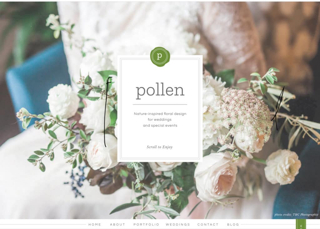
This is from Pollen, an eco-friendly Chicago wedding and event florist. The tagline reads: ‘Nature-inspired floral design for weddings and special events’. The CTA invites you to scroll down. Notice the menu is positioned beneath the slideshow header so as not to disturb the beautiful photos of their work.
Clear CTA’s
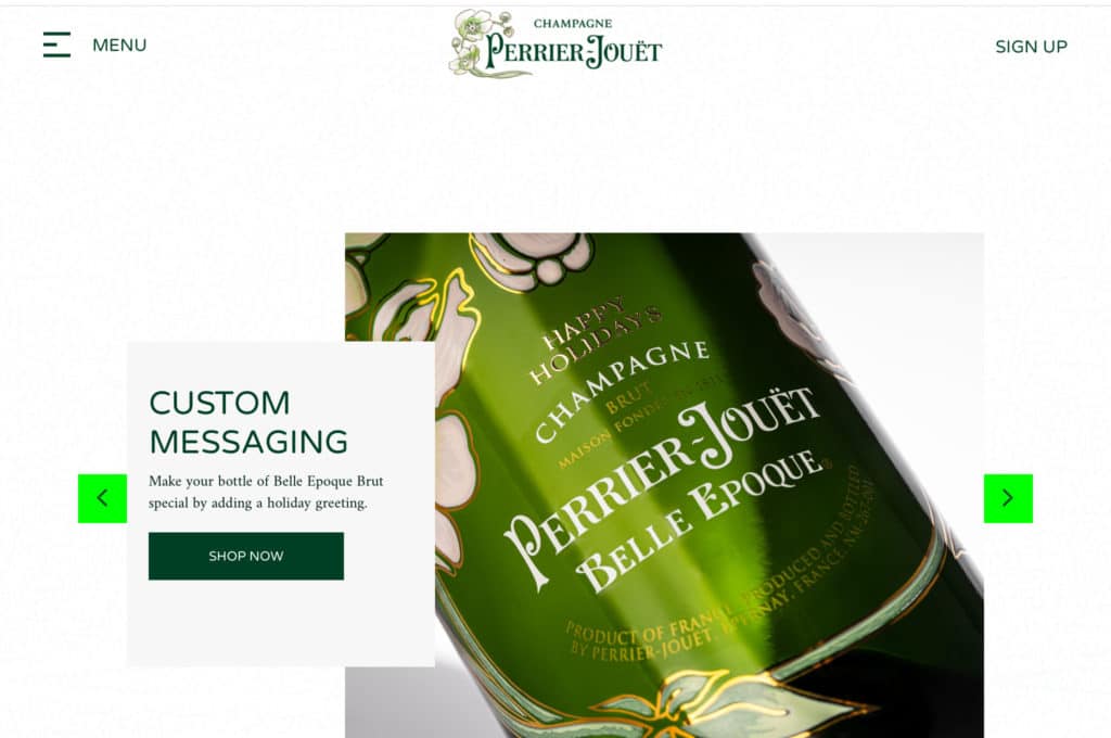
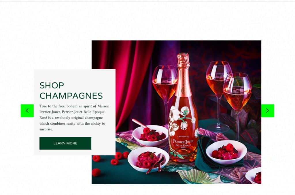
Perrier-Jouet Champagne. With each slide in the slide show, the CTA changes.
A calendar on your homepage
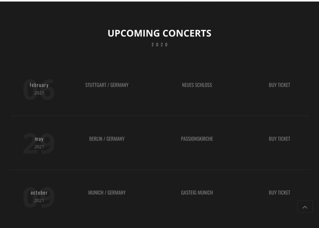
This is from the artist Bozo Vreco, who a musician and composer reviving the art of Sefdah. Here Vreco’s upcoming concerts are featured directly under his gorgeous header.
Videos on your homepage
Scrolling down the page, Vreco features his latest videos to great effect.

This section is followed by a section featuring his albums, then a section featuring the latest news, then his photo gallery, then his video gallery. The entire page is held together by the black color, which makes the content pop. Though there is a lot of content, the intelligent grid layout and dark background keep everything quietly elegant.
Features on your homepage
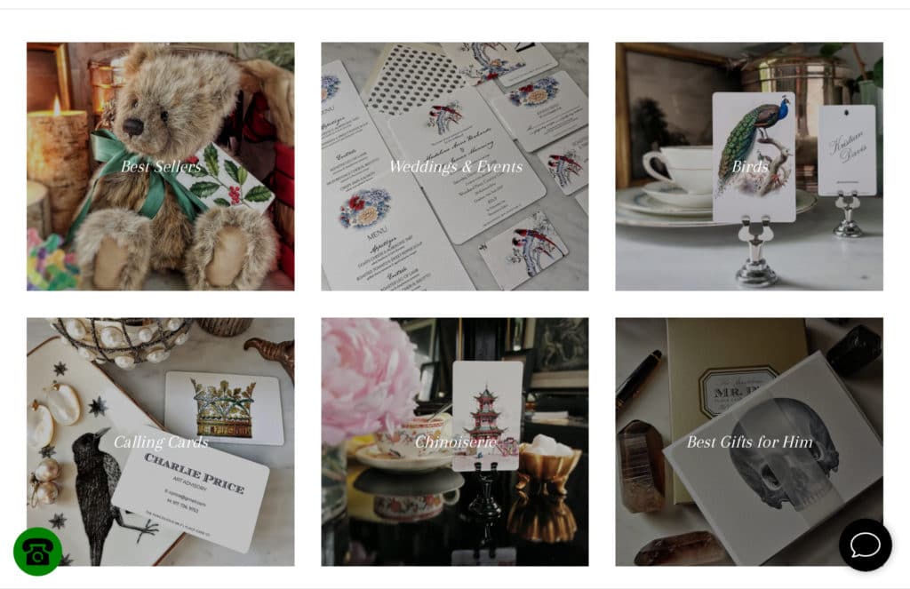
The Punctilious Mr. P’s Place Card Co. features a gorgeous header with a slideshow highlighting various sale items, ranging from place cards to jams. As you scroll downward, you reach a grid of various place cards, which you can explore further.
Instagram on your home page
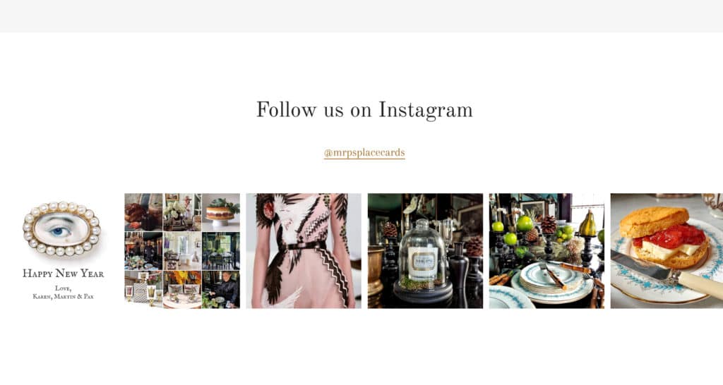
Mr P’s features its Instagram feed towards the bottom of the homepage.
Social proof on your Homepage
Mr. P’s again. Nicely integrated into the overall design of the homepage.

Strong headlines
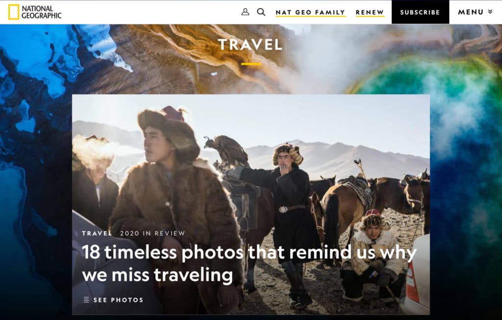
From the National Geographic homepage. I think this particular headline sums up 2020 succinctly: 18 timeless photos that remind us why we miss traveling.
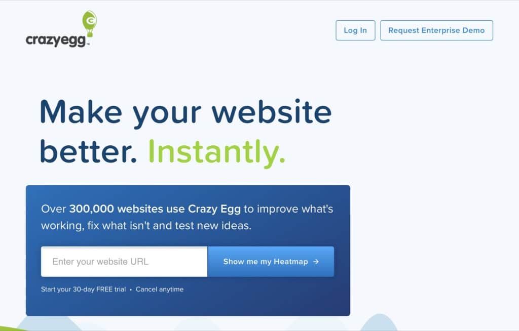
This example is from Crazyegg. They get to the point immediately because who wouldn’t want to have a better website?
Putting a face to your homepage
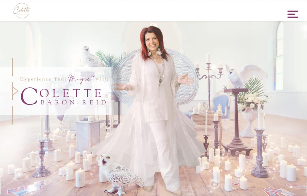
People want to know who they are dealing with. So you might want a short section that leads to an About page from your home page. Alternatively, you might want to feature an image of you and your team in the header of your home page. Colette Baron Reid is an internationally renowned intuitive, author, television personality, and the creator of multiple oracle decks. You get a good sense of who she is as soon as you land on her homepage.
Testimonials on your homepage
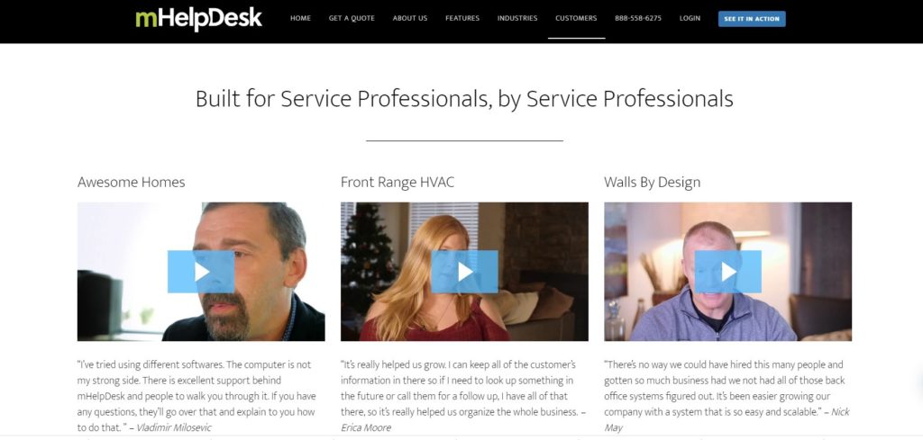
mHelpDesk utilizes written and video testimonials.
Conclusion
To design a great homepage that keeps users interested you can include the following features:
- Your contact information, a search feature, and links to social media in the header
- A relevant and eye catching design, image, video, or slideshow in the header
- A powerful headline and value proposition
- Well written and researched content that utilizes keyword phrases and speaks to your targeted audience
- Easy to use call to action buttons
- Social proof
- Testimonials
- Featured links to various sections of the website
- Calendars
- Videos or image galleries
- Images of you or your team
- High quality images that tell your story
- Readable text
Remember to change up stale design and update your pages and posts with new information regularly.
