Skip to content

Brandnbuildwebsites

Build branded websites

  • Home
  • Building a branded website / Start hereExpand
    • How to choose the best color palette for your website
    • How to choose the best fonts for your website
    • How to choose the best brand images for your business
    • How to design your website layout
    • How to make a WordPress Website
  • Blog Tutorials
  • Choosing the Right Web Hosting
  • Resources
  • Get a branded website
  • Contact
Brandnbuildwebsites
Build branded websites

How to choose the best color palette for your website

Facebook
Twitter
LinkedIn
Email
Reddit

Table of Contents

How to choose the best color palette for your website

On our Start Here page, we outlined the main elements that go into the design of a branded website. One of the most significant elements was finding the right color scheme. Tests have shown that 60-90% of users’ subconscious  judgments are made on color alone. Therefore, it is critically important to establish the right color scheme from the beginning. 

There are several ways to do this easily:

  • You already have a branded product with logos and a color scheme 
  • You have professional photos of your product 

Those colors should determine the overall look and feel of your website. But what if your branding is out of date or you have none? Where should you begin?

You should begin by considering your industry. Your industry can fall into one of the following categories:

  • Corporate / Business
  • E-commerce
  • Service
  • Creative

Your next consideration should be your target customer or client. Begin by creating an ideal consumer profile. You will consider their:

  • Gender
  • Age
  • Location (urban, suburban, rural, national, international, regional etc.)
  • Education
  • Income
  • Job / Career
  • Marital / familial status

Different generations, income groups, and genders have specific color preferences. Knowing who you are marketing to  will help you narrow your choices. 

The psychology of color

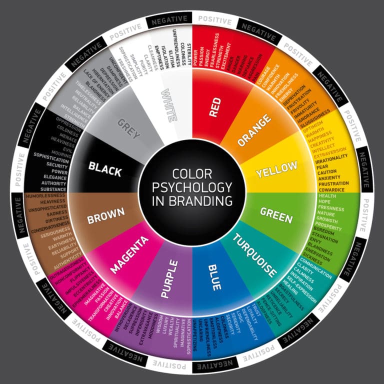
The advertising industry has spent billions researching both the positive and negative aspects of colors, their effects on emotions, and how those emotions influence buyer habits. When designing your website, you will weigh the negative and positive connotations of colors before you make a determination which colors to deploy. Interestingly, since colors come in tints, tones, and shades their impact on our emotions and perceptions can vary greatly.

What is the difference between color, hue, tint, tone and shade?

  • Color – is the term we use to describe every hue, tint, shade or tone.
  • Hue – refers to the dominant color family of the color. These are the brightest colors of the color wheel. Black, Grey or White are never hues.
  • Tint – commonly known as a pastel. This is any hue with the addition of any amount of white. A tint makes a color lighter, but not brighter.
  • Tone – any hue with grey added to it. Tones are the most sophisticated and elegant colors. 
  • Shade – any hue with black added to it.

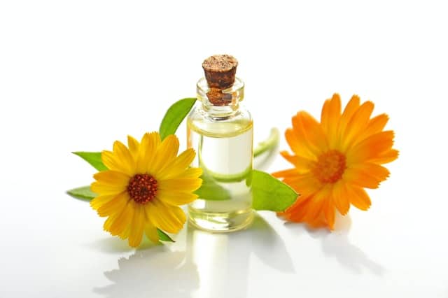
Let’s take purple as an example. Purple is often used in the beauty / cosmetics industry. Hover to flip for more information. Use this website to find  Hex Colors
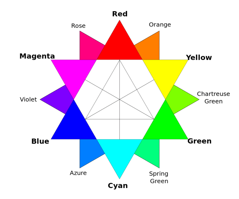
Hue

Hex color #800080

Purple

Shade

Hex color #6C006C
A shade is created by adding black. This is also a shade. #320032

Tint

Hex color #FF6CFF
A tint is created by adding white. This is also a tint. #ffe2ff

Tone

Hex color #5E225E
A tone is created by adding grey. This is also a tone. Hex color #4a364a

Primary, Secondary and Tertiary colors

Primary colors are:

  • Red
  • Yellow
  • Blue

Secondary colors – are made by mixing primary colors:

  • Green
  • Orange
  • Purple

Tertiary colors – are made by mixing primary and secondary colors:

  • Red-orange
  • Yellow-orange
  • Yellow-green
  • Blue-green
  • Blue-violet
  • Red-violet
How to choose the best color palette for your website
Courtesy of Dan PMK at English Wikipedia

How can I combine colors on my website?

Complimentary colors– Colors that are opposite each other on the color wheel and create high contrast. However, these colors can look garish when used together:

  • Red and green
  • Yellow and purple
  • Blue and orange

Analogous colors – colors that are next to each other on the color wheel. These color combinations are extremely soothing and used in the correct tint, tones, and shades can look sophisticated and modern.

Triadic colors – are evenly spaced around the color wheel, such as orange, green and purple.

Split complimentary – choose a color, then look at its compliment, then choose the two colors on either side.

Tetradic –  two complimentary pairs.

Square – four colors equally spaced around the color wheel.

Monochromatic – uses tints and shades of the same color.

What are white, black and grey?

In color theory, white is the absence of color, black is an amalgamation of the three primaries red, blue and yellow. Grey is intermediate between black and white. In the world of pixels, these are approximations. However, these three colors or non-colors, depending on the theory you subscribe to, are incredibly important in the design of your website. 

What about metallic colors?

I love them and use them as accents often. I recently finished a website where I used gold metallic as the background color of an entire footer. Metallics, of course, come in shades and tints as well.  Though metallics can occur within most colors, true metallics are gold, brass, bronze, silver, copper, and pewter.

Gold #9c7c38

Silver #aaa9ad

Copper #b87333

Gender and color preferences

Women tend to like softer colors and tints. Men tend to like brighter colors and shades. Reported across the Internet:

Women's Favorite Colors

Men's Favorite Colors

  • Blue
  • Purple
  • Green
  • Blue
  • Green
  • Black

Women's LEAST Favorite Colors

Men's LEAST Favorite Colors

  • Orange
  • Brown 
  • Grey
  • Brown
  • Orange
  • Purple

Is that actually true? There is a big difference between these colors

Pure Orange
A deeply unappealing color #ffa500
Orange
Loved by creatives #ff3b00
Brown
A deeply unappealing color #654321
A Warm Sandy Color
Loved by Generation X #c88e56

Color preference by generation

Each generation has been found to have particular color preferences.

Boomers – azure, greenish-blue, jade green, grey lavender, sophisticated purples, and silver

Generation X – indigo, violet, shades of green, black, sandy colors and charcoal greys

Generation Z  – Cheerful pastels and yellow

Millennials  – soft tonal colors, like dusty pink, cantaloupe, blush, lavender and /or bright supersaturated colors

Where will I use color on my website?

You will be using color on /in  your:

  • Header
  • Footer
  • Call to action buttons
  • Fonts
  • Social Media buttons
  • Background aka whitespace
  • Overlays 

How many colors should I use?

There are really no rules to this, but in contemporary design simple is best.

Should my white space be white? 

Not necessarily. Whitespace simply means empty space. It can be any color, including black, as long it enhances your images. Whitespace can really pop when you use the lightest tint of your footer or header colors. Cloud is a  color that can be used in parts or all of your whitespace. Often, it can set off your images better than plain white.

#EFEEED

How should I combine colors on my website?

Sometimes color combinations will be preset and come with your theme but they tend to follow color theory stringently and look commonplace and unattractive. There are also a number of tools you can use to pick colors out of photos or generate color combinations. Whenever you use Color Hexa or a similar site to view a hex color, you will be presented with the shades, tints, and tones of that color in addition to close alternatives to that color and complimentary, analogous, split complimentary, tetradic, and monochromatic color schemes. However, in their purest form, those colors can be too intense or garish, so you must soften them by using tints or tones. 

Where can I get inspiration for my website color palette if I am a poor colorist?

You can get color inspiration from:

  • Nature – Mother Nature is an artist. From the colors of the ocean to the colors of the sky, nature creates the best color combinations. Observe and learn
  • Fashion – can be an endless source of inspiration. I particularly like the way colors and patterns are combined in Indian saris and Asian kimono.
  • Photography 
  • Art -study the work of the best colorists from Michelangelo to Delacroix to the Impressionists. It’s all online now
  • Interior design – pick up any shelter magazine for inspiration. You’ll soon see what does and doesn’t work in terms of harmony and mood
  • Other websites – get inspired but don’t copy 

Putting together the best website color palettes by industry

Let’s take a few examples from the coffee and chocolate industry:

  • My favorite coffee shop has a  well organized website, great photos, but its dark charcoal background really puts me off. Dark grey competes with the photos of brown coffee beans and doesn’t convey a pleasant mood.
  • My favorite coffee house has a fantastic video on the homepage that ushers in visitors through the front door and takes them into the space but the background on its webpages is icy white. It isn’t  exactly saying –  stay a while. 
  • My favorite chocolatier opted for a garish red background on its pages and combined it with a dull gold trim that overwhelms the heavenly confections. Additionally, the chocolates are shot against grey backgrounds.

So how can we fix this? Which palette can set off brown colors like coffee, tea and chocolate and be inviting without being overwhelming?

  • The first thing to know is that your product is already dark and it is probably being packaged in a brown paper bag.
  • The second thing to know is that if we want to use white spaces to evoke a clean and contemporary feel, we can frame photos with warm metallics to counteract sterility. Additionally, we can avoid going full width with our photos and frame boxed sections with neutral colors, like taupe, leaving the rest of the site white. 
  • The fonts can vary from standard grey to gold to deep olive green  to create visual interest.

Regardless of your industry, you should be using color to enhance your products or images. Don’t fight against them and don’t fall back on grey because you can’t think of anything better. 

White

Taupe

Green

Gold

chocolate
coffee
woman-standing-beside-flowers-inside-building-2048442-682x1024

Putting together color palettes by demographic

In 2017, I did a website for a medical spa. Until then, most of the spas websites in Chicagoland featured images of super skinny women in their early 20’s and were primarily styled in shades of blue, because spa = water? In any case, I was the first to implement a palette that sets off all flesh tones and has a sophisticated urban feel. I also used images of women of all races and colors. Though the targeted demographics are Generation X and Boomer women, I used photos of all ages and shapes. Now every medical spa in Chicago is more or less a variation of that website. 

All human skin tones have orange as their base. Notice how the website colors harmonize with the photographs.

Background

Title bar

Footer and preheader

Breadcrumb

Background

Headings, frames, buttons

Putting together color palettes for branded websites

Branding brings together visual elements, such as:

  • Images
  • Colors
  • Fonts
  • Videos
  • Graphics

The colors you choose for your website should be compatible with your imagery and appeal to your customer base. You will need be consistent across your website, logos, social media posts, business cards, mailings and newsletter. Having a brand means having a certain look that is easily recognized as uniquely yours. 

Standing out from your competitors

Some professions adhere to the same tired colors often enough that they have become clichéd. The typical doctor’s office uses these colors:

#2B6CB0

#FFFFFF

#4CCB5D

The green is a recent addition to medical web design.  Generally, medical websites feature the most sterile hues of blue and white. On the one hand they look clean. On the other, they evoke feelings of coldness, depression and  anxiety.  How do the colors below make you feel? I find them much more soothing.

#2B5984

#EDF2F7

#468199

#2B5984

#F7FAFC

#469995

Sending powerful subconscious signals with your color palette

A couple of years ago I was asked by a nursing service to create a website for its non-profit division that helps people over fifty reinvent themselves in life and work. The principles asked for burnt orange and brown. Fortunately, I managed to convince them those colors signaled nursing home rather than renewal. I went with soft green colors instead. Bright green would have been too youthful but a grey green is much more sophisticated, though it signals regeneration. Interestingly, green is a neutral and can be used to great effect as a background color. 

Header

White Space

Footer

Header, Footer

White Space

White Space

Buttons

Deciphering client speak

Corporate

What do business people mean when they say, ‘I want IBM Blue’ or ‘I want IBM colors’? In essence, they are asking for a clean, minimalistic color and design scheme. Below are the colors I used when a businessman asked for IBM colors for his blog. Additionally, he wanted to feature a brass mechanized works in the hero section of the home page since he primarily blogs about the way information is integrated within corporations.  I gave him a deeper blue and white and cloud (in the white space). I used a brass / gold title fonts to warm up the blue and white.  He was thrilled with the result and his colleagues were highly complimentary. In my opinion, a deeper blue carried more weight than a bright blue. The gold, rather than a yellow-which might just be saying Swedish flag, is richer and warmer.

IBM

Header

White Space

Footer

Header, Footer

White Space

White Space

Font on title bar

Women

Women’s overall second favorite color is purple. Purple is a rich color and in the right shades or tints, it can evoke peacefulness and spirituality. Go too light or too pure and you might end up with a webpage that is too childish or vulgar. On the other hand, tones and shades of purple can look very sophisticated.

Recently, I was asked to design a website for a holistic medical practice whose primarily clientele are women. The doctor gave me a single directive: ‘My color is purple.’ 

To bring the site together I used multiple shades and tints of purple, photos of  green nature in the headers, and gold as an accent color. The background was left clean and white. So what do we know about purple? Green is its best compliment in a subtle color scheme. Another compliment is yellow. However, yellow combined with purple is lurid, but purple and gold used in small amounts is rich, subtle and attractive.  Pink and orange would have made the site too gaudy.

Various

White Space

Various

Fonts, frames and buttons

Transparent overlays

Putting together colorboards based on generational preferences

Baby Boomers – azure, greenish-blue, jade green, grey lavender, sophisticated purples, and silver

Grey lavender

White Space

Purple

Silver

Azure

Jade

White Space

Turquoise


Generation X – indigo, violet, shades of green, black, sandy colors and charcoal greys

Indigo

White Space

Sand

Green

White Space

Sand

Charcoal

Camel

Millennials  – soft tonal colors, like dusty pink, cantaloupe, blush, lavender and /or bright supersaturated colors. Millennials also like black. 

White Space

Dusty Pink

Blush

Cantaloupe

White Space

Pale Lavender

Lavender

Black-purple

Generation Z  – Cheerful pastels, neon colors and Generation Z Yellow

White Space

Gen Z Yellow

Other Yellows

Blue

UFO Green

Deep green

Mustard

White Space

How trendy should I get with my website color palette?

Someone once said that a year in website design is like ten years in fashion. Trends change. Keep it classic and you won’t need a redesign every three years. However, color, like paint is the easiest thing to change. If you keep your design and layout sensible, clean and well organized, you can always switch your images and colors as time goes on and your website evolves.

Ultimately, your website colors should enhance the graphics and photos on your website.  You can use a color picker technology to easily choose colors. Of course, you can use fewer colors in your design rather than the entire palette presented. Let’s take a few examples:

Florist

White Space

#bdbdc8

#33352c

#9ca1bc

#9ea296

#535355

Confectionary

White Space

#974134

#cb9891

#9ca1bc

#DCBEBA66

#535355

Conservancy

#b2bfb6

#0451b5

#0f9ab4

#9ca1bc

#04217d

CBD Oil

#eff0e9

#D4980CAB

#dad4af

#817560

#455416

Summary

  • The psychology of color shows us the impact of colors on peoples’ emotions
  • Color theory explains the nature of colors and how certain combinations work together
  • Tone, tint and shade explain how adding black, grey or white can change a hue and make it lighter, darker or more sophisticated.
  • Color preferences can be broken down by generation and gender
  • Inspiration for combining colors can come from nature, fashion, interior design, and photography
  • Any website can be improved by understanding how colors work together
  • The objective in choosing colors is to set off your images or products, not compete with or overwhelm them
  • Creative websites, professional websites, e-commerce and service websites should reflect their respective industries
  • There is no particular color that hastens conversions, rather you want to appeal to your base so much that they will stick around on your pages to find out who you are and why they can trust you
  • 60 to 90% of decisions about websites are based on color alone
  • Website designers tend to be men. Men naturally prefer darker, saturated colors. If your web designer is technologically rather than artistically inclined, don’t leave color choices up to him. Be actively involved in the process of choosing your brand colors
  • Remember, the design of your website is not so much about you as it is about your end user
Facebook
Twitter
LinkedIn
Email
Reddit

Links

Build a Branded Website Overview
Choose the Right Font for Your Website
Design Your Website

ABOUT

I’m Lily and I will teach you about marketing, content writing, SEO, design and  branding – right  along with the best hosting, plugins, assets, platforms and themes for your business.

All the information here is free. I only ask that you use my affiliate links. That way I get a commission and can keep delivering free content to you. Thank you for your support.

Recent Posts

  • How do I drive traffic to my website – for free?
  • 10 economical ideas for small business marketing
  • Create an author website that kicks ass in 2022
  • Powerful storytelling for small business owners 2022
  • 6 proven tips when branding for small businesses
  • What is the best WordPress page builder 2022
  • Best Managed WordPress Hosting in 2022
  • Is the RankMath SEO plugin the best on the market? (2022)
  • Will Google’s core web vitals update kill my website?
  • Learn how to blog like a pro – for free
  • What should I put on my website home page?
  • How to design a great website header

Pages

  • Blog Tutorials
  • Building a branded website / Start here
  • Choosing the Right Web Hosting
  • Contact
  • Get a branded website
  • Home
  • How to choose the best brand images for your business
  • How to choose the best color palette for your website
  • How to choose the best fonts for your website
  • How to design your website layout
  • How to make a WordPress Website
  • Resources

© 2025 Brandnbuildwebsites. All rights reserved

Privacy Policy

Terms of Service

  • Home
  • Building a branded website / Start here
    • How to choose the best color palette for your website
    • How to choose the best fonts for your website
    • How to choose the best brand images for your business
    • How to design your website layout
    • How to make a WordPress Website
  • Blog Tutorials
  • Choosing the Right Web Hosting
  • Resources
  • Get a branded website
  • Contact
Search