How to
Design your website layout so that it converts browsers into buyers
How to lay out your website design
Laying out your website structure will involve planning beforehand. You will want your pages to hold a user’s interest, while delivering the content that they are searching for. You will need to combine aesthetics with a logical structure and great content in order to achieve your purpose. The following steps will help you design and lay out your pages.
Decide what kind of site you are building
The first thing to consider before designing your website layout is the type of site you will be creating. A website can be one of the following:
- Corporate / Business
- E-commerce
- Service
- Creative
- Informational
- Entertainment
- Blog
The next thing to consider is the purpose of your site. Which one of the following best describes your objectives?
- Sales
- Lead generation
- Building your reputation
- Describing your expertise
- A combination of the above
In most cases, you will be looking to turn browsers into buyers by tapping into their needs and demonstrating your value by solving their dilemmas. The architect, Louis Sullivan, coined the phrase, “Form follows function.” Therefore your design will be dependent on what you want your users to do. If generating leads is your primary motivation for having a website, then having multiple ways to contact you should be a primary consideration. Your phone number, which allows the user to dial at the touch of a button, a contact form, a pop-up chat box or automated scheduling system, or any combination of those features should figure prominently on your site.
Make your website responsive
Over half of your prospects will be initiating searches from their phones. Therefore your website must be responsive (a site that adjusts to look and function correctly across all devices). This is important as it will influence your design all around, from your images, text, fonts, layout and call to action buttons.
Search engines rank responsive sites higher and users will judge you on the usability and looks of your website, regardless of your personal knowledge and expertise.
Decide on your geographical area
Will your site be:
- Local
- National
- International
This will drive the design and build of your site. For example a local book store vs. an online bookseller. The entire structure of the site will change from local to e-commerce.
Create a user profile
In order to design a website properly, you will need to consider the segment of the market you will be appealing to. What should you consider?
- Age
- Location (urban, suburban, rural, national, international, regional etc.)
- Education
- Income
- Job / Career
- Marital / familial status
- Gender
These factors will influence your tone of voice, the color preferences of your target demographics, and the fonts which will enhance the nature of your website. For detailed instructions and explanations, please consult the following pages:
Study your competition
You want to be better than your competitors, don’t you? So when you study your competition, you will want to see what works and what doesn’t work on their websites. Write down the features you think work well and the things that you don’t like. Think about everything from the way information is displayed to navigation to ease of use to colors.
If you are looking at local competitors, broaden your search. If you search for ‘best + your category or design winners in your field, you will get a sense of what is trending in design.
Additionally, there are competitor analysis tools, which will give you valuable insights into web marketing. You can get an insight into:
- The key phrases they are ranking for
- Authority through backlinks
- Social media shares
- Tracking Tools they are using
- Platform their website is built on
Decide on your platform
You will need to decide on the best platform for your purpose:
WordPress.org – WordPress is open source, has tons of free plugins, and free or premium themes. WordPress is customizable, secure, and the best platform for SEO. With outstanding page builder integration, such as Elementor, you will never need to code. Additionally, you own your website and your data
3. Shopify – is an e-commerce platform. With attractive templates, you can get started quickly with your online store. You can sell physical and digital products or services. Shopify excels for sellers who use drop shipping.
4. BigCommerce.com – is an e-platform website builder for large stores. No coding is required
6. Squarespace – is a drag and drop builder that is best for creative professionals. The templates are geared towards visual displays
7. Wix – is a drag and drop website builder with hundreds of templates. Mobile optimized, it is considered to be good for small business sites
8. Weebly – features easy to use responsive themes. Limited customization unless you can code
Decide on your colors, fonts and images
Once your user profile or profiles are defined, you can consult the following pages to learn how to best choose colors and fonts aimed at those segments:
Choose the best colors for your website – here you will learn about:
- Color preferences by gender
- Generational preferences for various colors
- How to pull colors from images
- How to create color palettes
Color is critical to the success of your website, since 60 -90% of judgments are made by color alone.
Choose the best fonts for your website
Here you will learn about:
- The various types of fonts
- Which fonts are appropriate for the body of the text and which fonts you should use in hero sections, heading, and for decorative purposes
- Which fonts are easiest to read
- How to pair fonts for greatest effect
In order to choose images, you must also think about what will appeal to your segment. Sites like Unsplash and Pexels will have images that appeal to a younger segment of the population. Shutterstock and iStock will carry more polished images. Never let stock images stand in for you, your team or your product. Hire a professional photographer to take those images. Authenticity is key to bonding with your audience and it is well worth your money to have great head shots or shots of your products.
Below is a sample of an image, a corresponding color palette and two paired fonts:

Travel Blog – This is Cormorant
I used Cormorant in the heading and Lato in the body of the text. I used Color Picker to extract the colors in the photo. When designing the site I can try out these colors or various shades and tints on backgrounds, fonts, sections, footers, headers etc.
White Space
#dcdccc
#6b7020
#0ea9d7
#829980
#a5cbe2
#72e0ea
Decide on the basic architecture of your website
The standard architecture of your website will include the following:
- A Home page
- An About page
- Services or Product pages
- A Contact page
And sometimes
- A Blog feature
- A Portfolio
- FAQ pages
Keep in mind that there should be no more than three levels to your site. When creating sub-menus or mega menus, group things that belong together in a logical manner. One of the most glaring signs of an amateur website is when information is arranged in a haphazard manner.
Information you need to have above the first fold
The first fold is what the user sees before they start to scroll. You will want to display your pertinent information in that area, so that the user will know what your site is about, how to reach you, and which actions you want them to take. The design and information in this area has to grab user attention so that they will stay on your site. Important things to include above the first fold:
- Contact information – whatever pertains to your site, such as address, email, phone number
- Cart, if applicable
- The name and nature of your business
- An engaging Hero section that draws the user in
- Call to action buttons, such as Explore, Buy, Read More, Join, Login, Sign up
- Social share buttons
- A menu of pages
- A search feature
- Logo
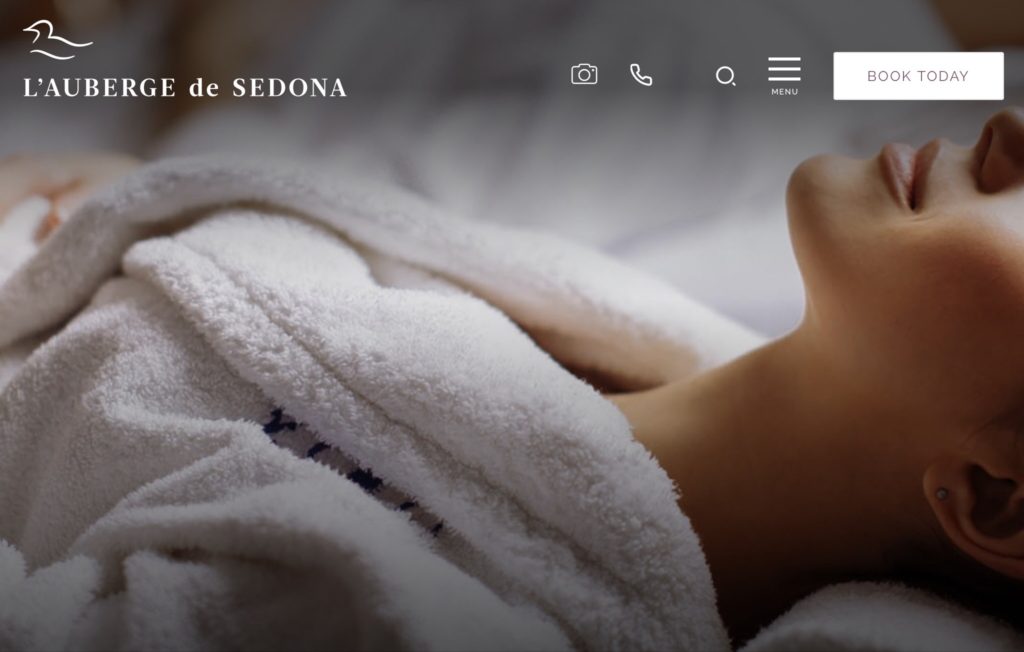
Above the fold
What do we know about the page right away?
- It’s in Sedona
- It’s a spa in an auberge ( hotel in the countryside)
Features:
- The camera icon takes us to images of the hotel
- The phone icon lets us call with one click
- The search feature allows us to search
- The hamburger menu drops down
- The Book Today button allows us to book online
What should you feature in your footer?
Depending on the nature of your site:
- Your menu with links to pages
- Location
- Hours of operation
- Map / Directions
- Sign up form
- Copyright notice
- Social media icons
- Social media widgets with your latest featured posts
- Search feature
- Logo
- Awards, certifications or memberships -best to use logos to save space
- Links to review sites like Yelp
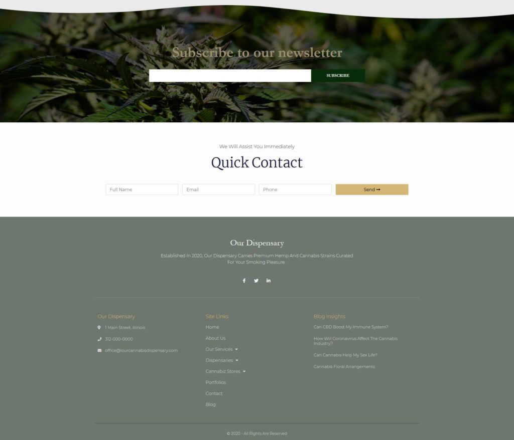
Comprehensive footers
This is a sample page I did for a local dispensary. I used one of the Elementor footers. As you can see it is quite comprehensive and you can mix and match features. This one includes:
- Newsletter sign up
- A contact form
- Social media links
- Direct dial feature
- Address
- Site links
- Latest blog post links
Create logical navigation
When creating the best layout for your website, know that your user can land on any page on that website. Within a couple of clicks, they will need to be able to navigate around the entire website. You can create your navigation in the following manner:
- Make your menu visible in the header and/ or footer
- Use breadcrumbs as a secondary guide if your site is large
- Use sidebars with links to other pages
- Link your logo to the home page
- Display the site or page title prominently or across your hero image
- Use internal links to create structure within your website. It helps users and search engines
How to lay out the sections / content on your pages
If you are new to building websites then you can use page templates provided by your platform, page builder, theme, or trusted sites.
If you want to design a unique site, you can still do it easily with page builders, like Elementor Pro. How then should we design our pages? We know we need the following:
- A header, which might feature our menu, contact information, logo and so on
- A hero section with a beautiful image or video and a catchy headline and call to action buttons
- The body of the page with important information about our site
- A footer
- A sub – footer with our copyright information
What should you put into the body of your webpages?
It is critically important to your success to have a well designed site, because 95% of users will decide whether to stay on your site based on design alone.
- Leave plenty of white space. You don’t want to overwhelm the user with too much information or too many images
- Steer them to where you want them to go next by providing focus
- Think about how people read naturally in the West – across and down to provide flow
- Think about what you want to accomplish
- Think about what you want the user to do. For example: buy, explore, read more, book an appointment
- Link to other pages on your site
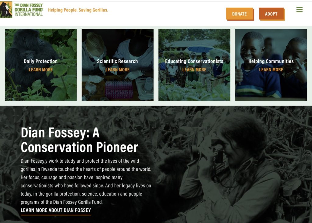
The body of your non-profit webpage
Diane Fossey Gorilla Fund
Immediately below the hero section, which features a photo of a baby gorilla, we have sections that will open to pages where we can learn more about the various programs that the fund endows. Additionally the donate and adopt buttons are featured prominently in the fixed header.
Not seen here: a special projects section featured beneath the bio and below that, various blog posts before the footer. Not a ton of white space here but it is very well organized and the green filters placed over the images hold the design together.
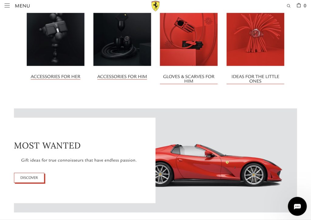
The body of your online store
Ferrari has an interesting Home page design. Underneath a static hero image of the Ferrari SF90 Spider, is a video featuring red racing cars and red racing gear and clothing. Very powerful messaging to the viewer, since the cars are shown on the track and on the road. From a discover more button placed over the video you are redirected to the store. which features Ferrari accessories.
Additionally, Ferrari uses the color red in an absolutely brilliant manner across its pages to build excitement and interest.
The body of local business webpages
This is a supercool site. The coffees are presented by their dominant taste notes. Each section is clickable and opens into another page, which gives more information and choices.
What information you should feature on each of your website pages
The information you put on your pages depends on the kind of site you are building but generally:
Home Page
- You are introducing yourself/ your company/ store
- You are communicating your value – your ability to solve their problems
- You are building trust. You can add some reviews to this page, if you would like. Some people also like to include a section with their latest posts
To learn how to design your homepage in depth, read What should I put on my website home page?
About Page
- Introduce yourself and your team, backgrounds and qualifications
- Communicate your values
- Tell a story about your history, your passion for your field, your struggles, and how you overcame them. This is the place where you bond with your audience
Services/ Product Pages
- I prefer that you create separate pages for each service and describe what you do for both SEO purposes and the benefit of your potential clients/ customers, rather than just listing them.
- Your product pages should feature clear photos and thoughtful descriptions that appeal to search engines and users. You can also add reviews
Contact Pages
- Address
- Google map
- Contact form
- Contact information, phone number / email
FAQ Page
- Answer the most frequently asked questions or give any pertinent information about your business, services, fees, and policies etc.
Blog Page
- Your blog posts – I like to show an image and an excerpt. Take the dates off the posts and keep them ever green by updating them as needed
- Add social media share buttons
- Allow for comments, if you want them
- Add a side bar with links to similar posts, or per my preferred method, at the bottom of the page
Portfolio Pages
Your portfolio should be laid out in an easily digestible, well organized way. Some people like to present case studies and how they resolved certain problems inherent to the project
In future posts, I’ll address the design of each page in detail. As always, beautiful images and well written text enhance your website
Don't overdesign your pages
Contemporary design is clean with a lot of empty space, legible fonts, and beautiful images or instructional videos. Avoid:
- Cramming information on the page without proper spacing
- Cramming images on the page
- Using too many special effects
- Using too many fonts or illegible or inappropriate fonts
- Using colors which don’t harmonize with the design or type of website you are building
What you should do:
- Check your design to make sure it works on mobile devices every step of the way
- Choose images that tell your story
- Chose colors and fonts that resonate with your demographic
- Write your content in a voice that resonates with your viewer and gives them the information that they are seeking. The content should be well organized and easy on the eye
Your call to action buttons
Your call to action buttons guide your users towards the steps you want them to take. For example:
- Read More/ Explore
- Buy now
- Add to cart
- Log in
- Start your free trial
- Download
- Request
- Join
- Get started
CTA buttons should be :
- Large enough to press by hand when on a phone
- Inviting and in a color that stands out from your design
- have some visual feedback. For example, the color changes or the button grows / shrinks / pulses when the user hovers above it
- Enough empty space around it, so that the user focuses on the button
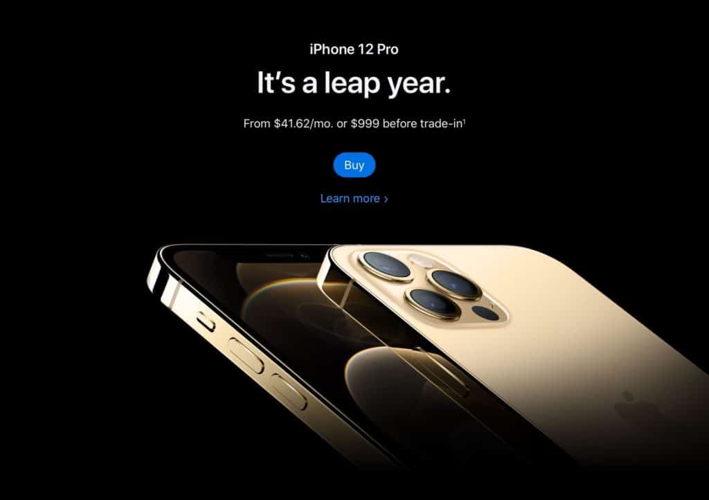
Succinct CTAs
Gorgeous design that tells you everything you need to know:
- iPhone 12
- You can make monthly payments
- You can purchase it at once
- You can trade your old phone in
Features:
- Buy
- Learn More -which takes you to a film featuring all the latest technological updates
As for the tagline, ‘It’s a leap year’, I suppose it indicates the tech leaps that the phone features and perhaps that you should leap to buy it.
Where should you put your testimonials?
Do not put testimonials on a separate page of their own. For best visibility put them on your:
- Home page
- About page
- Services page
- Near a Call to Action button.
- Above the contact form on a page.
- You can also pepper your pages with testimonials in appropriate sections. Generally, testimonials would appear in the lower sections of a page.
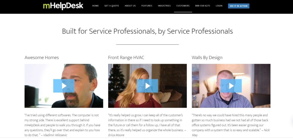
Video Testimonials
This is a nice feature from mHelpDesk that features a short blurb and a more comprehensive pop-up video, where the clients describe their problems and how mHelpdesk resolved them.
Where should you put your Google map?
You can place your Google map on the Contact page and in the footer of your site. Maps are a convenient and valuable element to add to your site if you are a local business.
Social media links and share buttons
Put your social media share buttons on the top / bottom /side of each blog post or page you want users to distribute.
Put links to your social media in the footer and/ or header of your pages.
How many words should you have on your pages or posts?
Google is saying that the quality you provide to your users is what matters most. However, a rule of thumb to follow is:
- 450-750 words on your pages.
- 1000 -1800 words in your blog posts
- 3000 – 4000 words if it is a pillar post or page
How to optimize your website
What does website optimization mean? By using tool and strategies, you will increase the performance of your website so that you can get more page views, leads and conversions. There are a variety of methods to optimize your pages
- Improve page speed
- Implement on page SEO
- Optimize for voice searches
- Make the website responsive
- Create high quality content
- Implement schema
I will address these topics in depth in future posts.
Website speed
Website developers are now talking about speed and that Google will rank your website with speed as a determining factor. No one likes a slow website but the truth is multifold:
- No one is looking at your webpage as a whole entity. They are looking at sections at a time
- The average load time of a page in the USA is 8 seconds. You can check how your industry performs industry here.
How to improve page speed:
SEO is an ongoing process
SEO is not a one time thing. As search engines get smarter, SEO needs to get better to fulfill user needs. Right now, a huge part of your SEO comes from the written content on your pages. The better written and more useful your content, the better your ranking will be. One thing to keep in mind is that voice searches are becoming more prominent.
What does voice search entail?
People speak in a conversational tone when using their smart devices. Therefore, it is wise if you create content to reflect those speech patterns or questions being asked. You can use FAQ sections prominently or write your content in a question and answer format. Google your topic and see which questions come up organically before you begin to write.
Take the dates off your posts
People will judge a post by the date so keep them evergreen by taking the dates off of them. Google says it not so interested in the dates of your posts, but rather in the quality of the content.
After a year, go back to your most trafficked or high ranking posts and take the time to update or add to the content in order to maintain relevance and keep your ranking.
Google Search Console / Webmaster Tools
Google webmaster tools are a suite of free tools which will give you insights into how your website is being used, indexed and is performing. It will also show you how you can fix issues. To get started:
- Sign into your Google Account
- Go to Google Webmaster Tools
- Click Add property
- Click Choose Website, add the URL
- Click on a verification method
There are good tutorials on YouTube that will show you how to use Google Search Console step by step and interpret the data you are being shown.
Drive traffic to your website
Once you are finished with your site you will have to figure out how to drive traffic to it. Here are a few methods:
- Blogging – it’s great for your SEO. You must do some initial research on what is being asked within your field. You must also do keyword research. Remember to create a regular posting schedule and strategy.
- Share those posts on a media pertinent to your field. For example in Facebook groups or on LinkedIn or in LinkedIn groups. The objective is to create great content that others will read and link to, which will raise your profile and visibility. This will save you from having to try to get links by guest blogging or spending time trying to get others to link back to you. Remember, blogging is a long term strategy, so give it 6-9 months to get noticed.
- If you feel comfortable on video and /or aren’t a great writer, then use YouTube to reach your audience. Google owns YouTube and features YouTube videos in searches.
- Have a newsletter or an email marketing plan in place
In future posts, I will teach you about advertising, funnels, landing pages and various marketing channels.