How to design a great website header
There are several elements you must employ in order to create a great header that captures a user’s interest and converts.
- Elements you should have in your top header
- The second part of the header, the hero section
- Make certain your design is responsive
- Keep website header navigation simple
- How important is the logo?
- What size should the website header be?
- Should you make the website header transparent?
- What about expandable mega – menus and side menus?
- Fonts in the website header
- Navigational special effects
- Parallax Effects
- Special effects to enhance CTA's
- CTA placement
- Should I have headers on each page of my website?
- Photo, video or slideshow in the header?
- Examples of Headers
- Examples of Menus
- Examples of effective fonts in the header
- Examples of effective CTAs
- Parallax Effects
- Special effects
- Where do I begin with my website header design:
- Where can I get my logo?
- Where can I get images or videos for my hero section?
- Conclusion
The first thing people will see when they visit your website is your website header. In order for you to successfully keep users on your pages, the information you convey must be clear, well written, well laid out, and attractive. In the past, the header used to consist of a strip of primary information. As websites have gotten more interactive and more beautiful, they now consist of that strip, which often overlaps or is interactive with the primary image above the first fold. The first fold is the point where you need to scroll to see more.
Elements you should have in your top header
The website header consists of two parts. The first part is the strip of information that contains the following elements:
- Navigation links to your various pages. This is called a menu
- Main contact information
- Logo
- Social media links
- A shopping cart
- Call to action buttons, such as Book now, Buy, Call us, Log in, Sign up
- A tagline – which is a short statement about your site and why it exists
This part of the header will remain consistent across the pages of your site to keep your information in front of viewers at all times and help them navigate the website. You can style your header in multiple ways, making it sticky / fixed so that it is always visible while the user scrolls down the page. You can make it transparent or translucent to show off your hero image or keep your branding at the forefront of the user. Alternatively, you may choose to not make the header sticky because it is distracting or gets in the way of the design.
The second part of the header, the hero section
The second part of the header consists of the hero image. This is your most valuable real estate. You will need to grab the viewers’ attention, hold it, and make them want to explore the rest of your site. Your hero image can contain:
- A relevant image
- A slideshow
- A video
- A colorized background with written information
- An image with a colored overlay or gradient color
- Illustrations or graphics
- A search feature
You can overlay the hero image with your navigational header. You can also include elements that will inform the user or lead to conversions, such as:
- Call to action buttons
- Amazing typography
- A brilliant tagline
Make certain your design is responsive
What does responsive mean? It means that your design looks and functions optimally across all devices from a smart phone to a big screen. That means you need to be checking your design every step of the way to make certain that it is displaying properly.
Keep website header navigation simple
You want to have a clean menu without too many categories in your header. In order to achieve this you will create main categories and then have a drop down menu from those main categories. Before you sit down to create your site, you can put together those categories on paper. For example a logical menu might look like the following:
- Home page
- About page
- Services Page
- Contact page
- Blog archive page
From your services page, for example, you will have a drop down menu with each page describing a particular service, which will be great for SEO and to help your customers / clients understand what it is that you do in detail.
Your navigation should be easy to understand, simple, and intuitive. Use labels that users will understand, like About Us, or Blog. Don’t opt for fancy variations. People, no matter how well educated they are, prefer to read at an eighth grade level.
How important is the logo?
It depends on the nature of your business, but generally the logo is meaningless in itself. If you are creating a branded website, it will need to harmonize with your product and the overall look and feel of your website. If you do not already have a logo then create the website first, decide on your colors and fonts – and then create the logo last. If you have a logo that is outdated or unattractive, you can always re-design it.
The most important thing to understand is that the website and the content on the website is primary and the logo isn’t critical in the initial phases. You can also feature the logo in your footer with a link to your Home page rather than take up valuable real estate in the header or clutter up your design. Remember your logo should be proportional and harmonious, so don’t let it overwhelm your header.
What size should the website header be?
The header itself should be slim and unobtrusive. The hero section should be large and eye catching. However any information you showcase must include the following features:
- The fonts must be legible. That means large and clear enough to be readable across all devices
- The fonts must be colorized for legibility. That means if your header is dark, your fonts should be light or vice-versa
- The call to action buttons must be legible, attention grabbing, and large enough to be pressable from a smart phone
Should you make the website header transparent?
If you have a gorgeous image / video / slideshow, you might want the header to be transparent. You will have to make certain that the information in the header is legible. If your header is universal, meaning that it appears across all the pages on your website, will need to choose color fonts that would be visible in all of the hero sections across your pages. Otherwise, you might need to write a bit of code to change the colors on the individual pages.
What about expandable mega – menus and side menus?
Mega menus work beautifully on large sites with a lot of pages, for example a site like Amazon.com. Retractable side menus are very contemporary, sophisticated, and chic. You will, of course, need to check how well they work on your site on mobile devices.
Fonts in the website header
Fonts can enhance both your branding and your website. To read about the various types of fonts, their symbolic meanings, and learn about perfect font pairings for maximum impact, please read our page Choose the best fonts for your website.
Navigational special effects
You can use elements such as underlining, boxing, and color changes to show visitors to your website where they are.
Parallax Effects
Parallax scrolling is a technique used to create the illusion of depth as the background of a section moves more slowly than the foreground. It can be used to great effect on artist’s, designer’s and photographer’s websites to showcase their work.
Special effects to enhance CTA’s
Call to action buttons should draw attention to themselves. Use colors that will make them stand out from your overall design but not be garish. Use hover effects that will change the color of the buttons, or make them pulse, shrink, or grow. You can style your buttons with gradient colors, rounded edges or borders. The more noticeable the button, the more likely a user will click on it.
CTA placement
There is some controversy among designers as to where the initial Call to action button should go. Some say it should be above the fold. Some say below the fold at the point where the user has enough information to actually want to click to find out more, schedule an appointment, or read more. However, this will depend on your site, your copy, and which actions you want the user to take. Keep in mind that the eye travels in a Z pattern – left to right, down to the next line diagonally; left and across to the right. Your CTA should be prominent and visible along that pattern. You can test and tweak your design to see what works best to increase conversions.
Should I have headers on each page of my website?
Yes, it makes your website much more attractive and interesting. However, don’t just go with random images. Your main header is on your Home page. The images in the other headers should be related both thematically and visually to give your website a cohesive look and feel. You can achieve this by using colored overlays, images from the same photographer, images that are similar in mood, texture, or feel. Remember that images always must add to the story you are conveying on your website and appeal to your particular demographic. To learn how to build a profile of your targeted demographic please read Build a Branded Website.
Photo, video or slideshow in the header?
Statistics indicate that video beats a static header out in terms of conversions. However, that video needs to be relevant to the website.
If you use an image, understand that human faces, particularly attractive female faces, generate the most interest from users.
Examples of Headers
Should you opt for a video, a slideshow, a photograph, or something completely different in your website header? Should you feature a minimalistic header, a transparent or translucent header, or a sticky header? You will need to think about what suits your purposes best. Let’s take a look at some examples.
Simple header
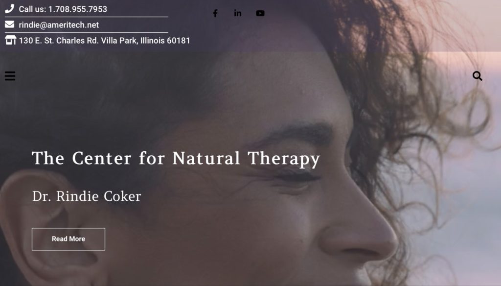
here we can see a slim band with contact information, social media links, a hamburger menu and a search bar. All other relevant information will be in the universal footer.

A translucent header
This video serves the purpose of introducing the type of client this business serves. The header contains relevant contact information, social media links, menu and a search feature. In the desk top version, the menu would be featured across the image from left to right.
A video in the header
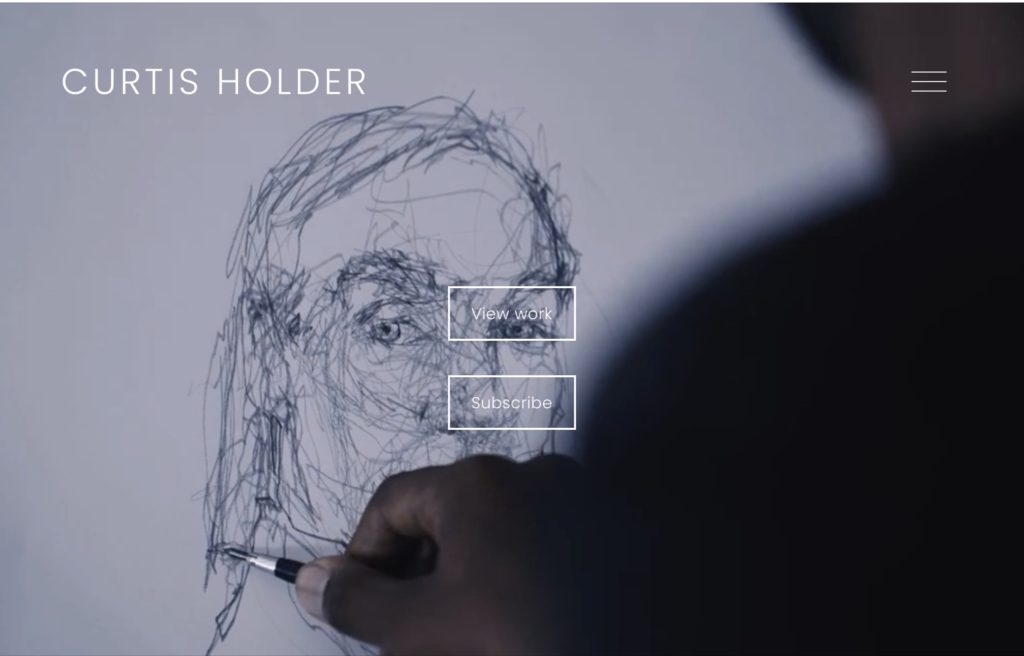
This is a wonderful example of how to use videos effectively. Artist Curtis Holder is filmed throughout his process: Gathering his materials together, working in his studio, showing his work in progress, and revealing the finished product. The viewer really gets to know the artist through this beautiful and effective video. The website is clean and absolutely gorgeous. It’s built with Squarespace.
A slideshow in the header
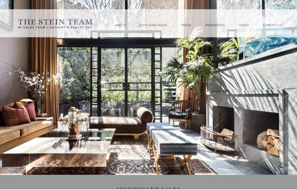
A gorgeous Manhattan Real Estate site belonging to The Stein Team. The slideshow in the header showcases some of the stunning properties they have sold.
An alternative website header
Rather than a slideshow, this online store features a cube that rotates to showcase the various selections available.
A great photograph in the header
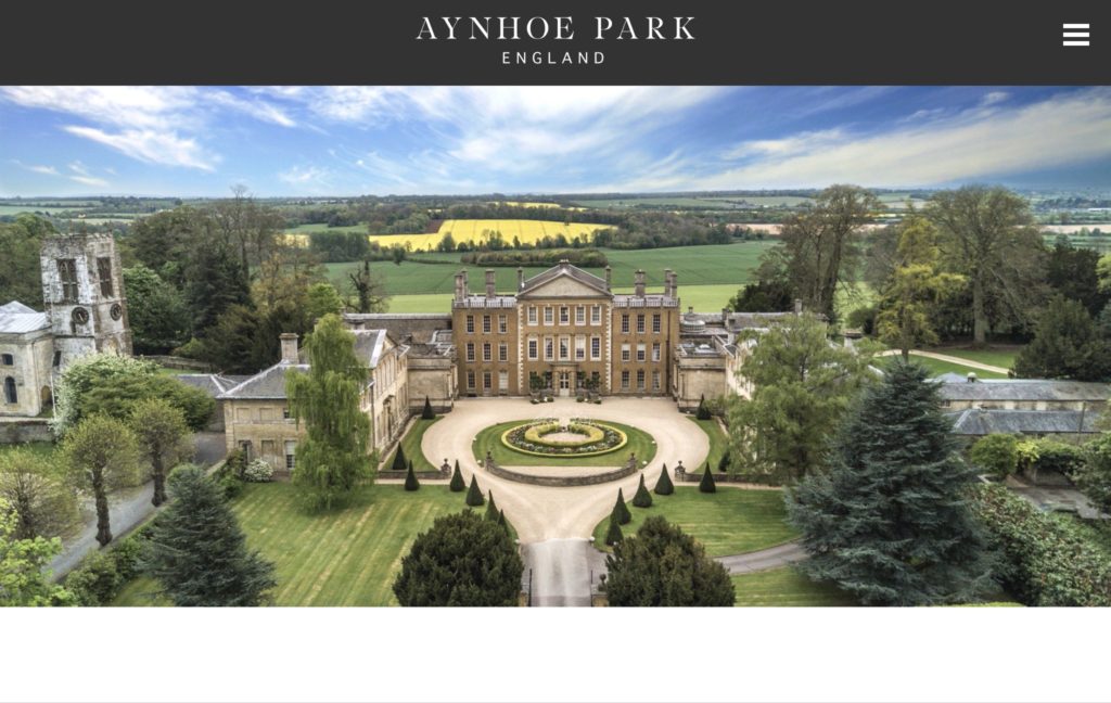
When you have a fantastic photo that tells the story of your website, there is no need to use more elaborate features in the headers. This is from Aynhoe Park, a great house near Banbury UK, that features exclusive private events, such as weddings.
Examples of Menus
Your menu needs to be legible and logical, but that doesn’t mean you can’t have fun with it and create something really beautiful. Here are a few samples to inspire you.
Dropdown menu
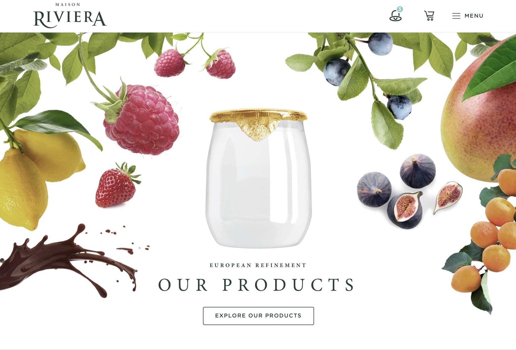
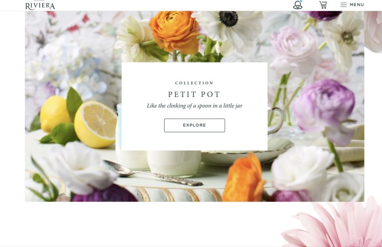
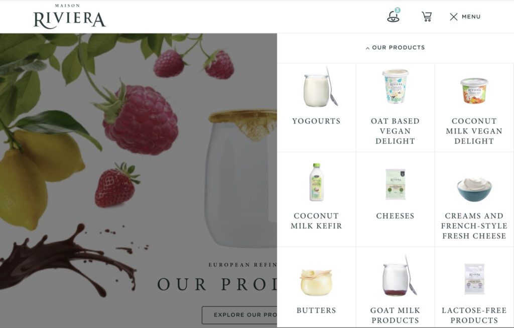
Below, a truly attractive dropdown menu from Maison Riviera featuring images of their dairy and non -dairy products. The entire website is simply magnificent and worth taking an in depth look at.
A Side Menu
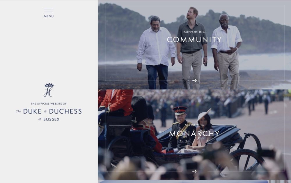
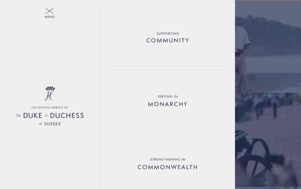
From The Duke and Duchess of Sussex, an elegant website, featuring a stunning side menu. Side menus are contemporary, chic, and hip.
Examples of effective fonts in the header
Fonts, like images, can enhance the experience users have on your website. Choosing the right fonts or combination of fonts takes a bit of practice. Here are a couple of examples to inspire you.
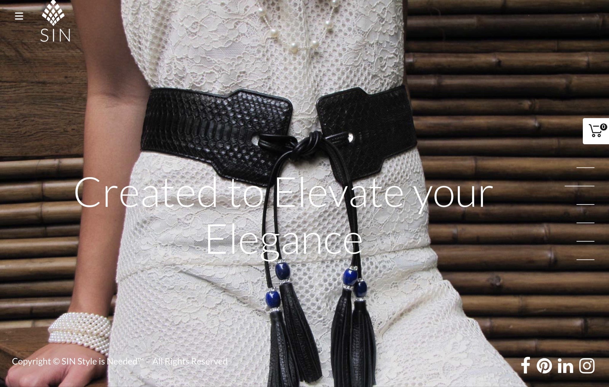
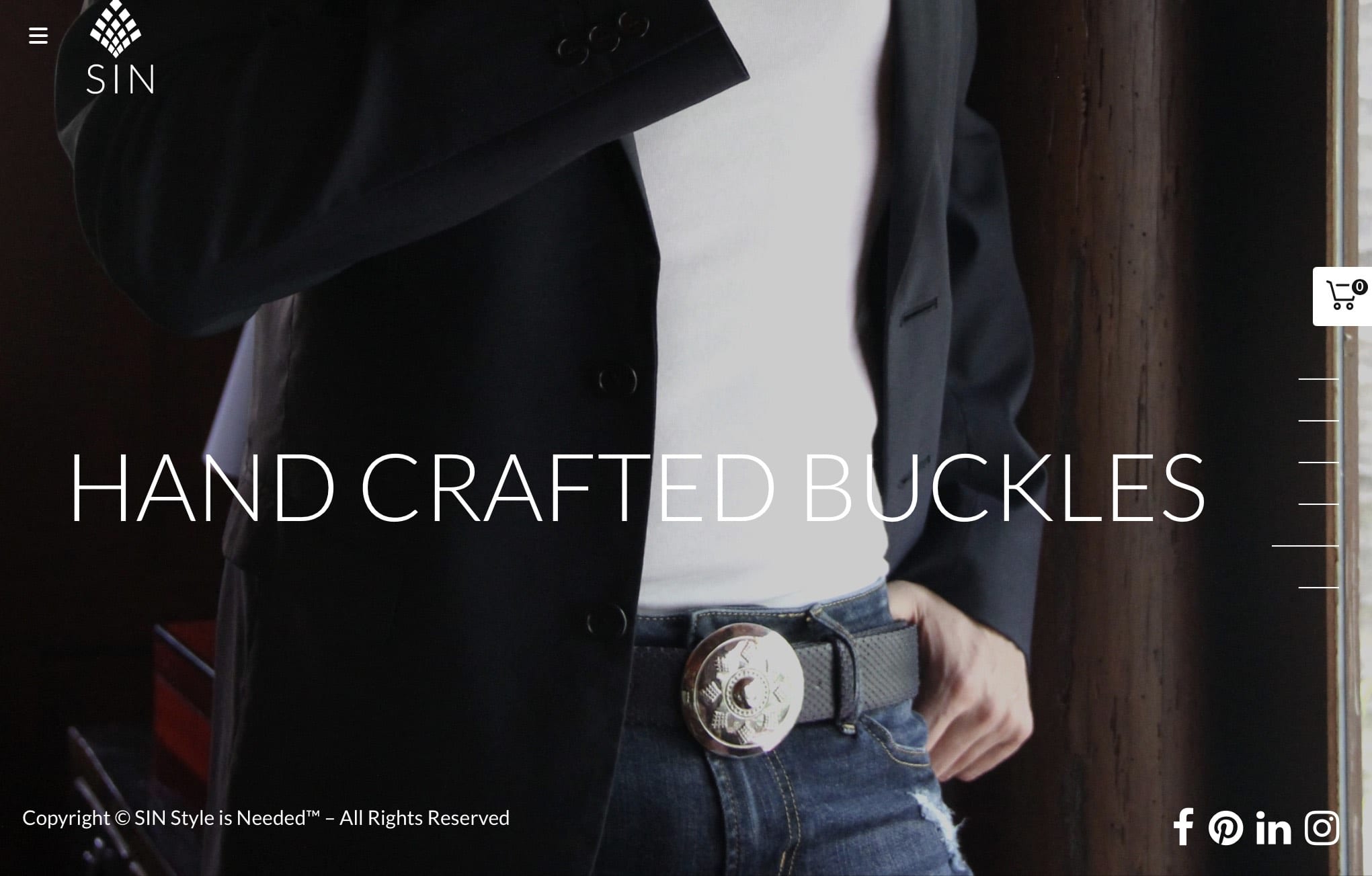
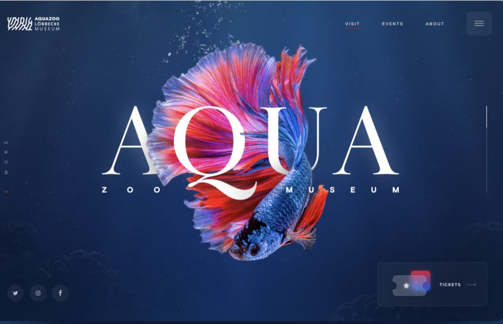
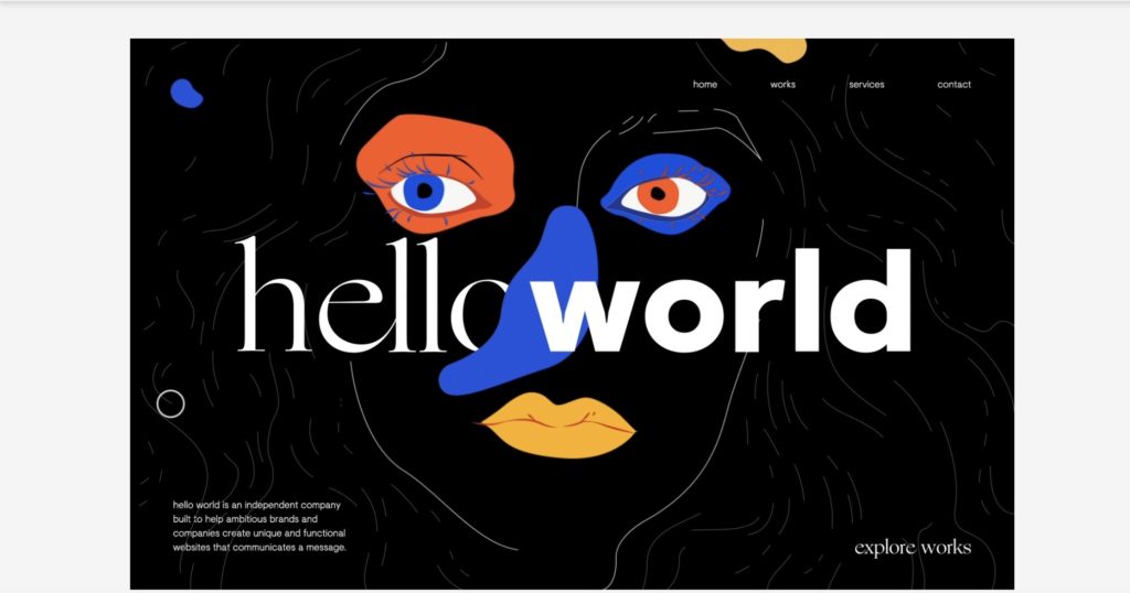
Fonts integrated with the image
Font pairings
A fabulous and dynamic effect with the paring of the slim ‘hello’ with the bold ‘world’. Check out the incredible animation by clicking the link below.
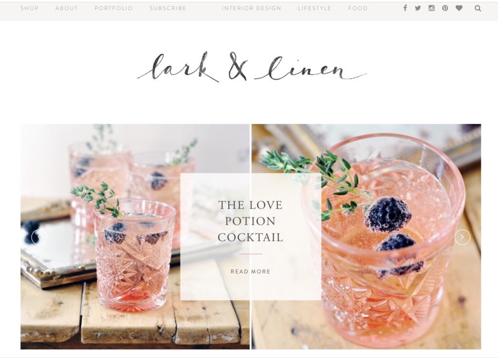
Fonts that convey a mood
Pretty and feminine, but also clean, contemporary, and minimalistic. This is a lifestyle, decorating, and food blog with a shop.
Examples of effective CTAs
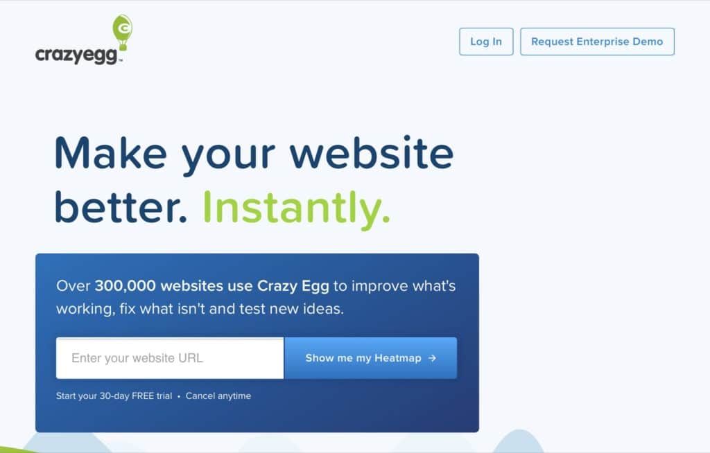
When you want the user to take an action, make it clear what you want them to do.
Simple
It’s absolutely clear what you are supposed to do here. The messaging is simple and effective.
Straightforward
I-phone, Buy or learn more

Parallax Effects
Parallax effects are used to great effect when there is a reason for them to exist. They are less effective when used decoratively, in my opinion. One of my favorite sites that uses parallax scrolling is Ralph Lauren’s non -profit Work to Ride. The website showcases the program, individual stories, people, horses, and clothing.

Special effects
You can create special effects like color overlays, blurs, shadow effects, image overlays ( two images) to enhance your header. You can also create a split screen with a colored column behind your text. I use Elementor Pro to create special effects on my pages. Below are a couple of samples that mix and match elements.
Gradients
Gradients have been back in style for several years and are predicted to be hotter than ever in the coming years. We can see gradients and liquid animation in this design.

Black and Textured
From Bozo Vreco ( Bozho Vrecho), a marvelous Bosnian musician and composer.

Where do I begin with my website header design:
- Do you have a branded product already? If you do and it is up to date, then your website design should harmonize with your product
- Make sure your website is responsive and that your design works across all devices
- Create a consumer profile. You are designing a website that will appeal to your targeted audience and not for yourself. To find out how to create a consumer profile, Start here
- Choose the right colors for your website. Judgments about your credibility are made in seconds and 60-90% of judgments are based on color alone! To understand how to choose the right colors for your website, read Choose the best color palette for your website
- Then you will choose the fonts that will appear in your header. To learn about fonts, the correct fonts for your branded imaging and how to pair fonts, read Choose the best fonts for your website
Where can I get my logo?
If you are on a budget, you can pay someone on Fiverr or you can create your own logo for free on the following sites: Canva or Tailorbrands, My advice is to create the website first and your logo last. That way, you will have a better idea of the colors, fonts, and style to use on your logo.
Where can I get images or videos for my hero section?
To find free images and videos on Pexels, Pixabay, and Unsplash. If you would like higher quality images and videos, try Shutterstock or iStock. Remember, featuring authentic videos or images of you, your team, your job, your store, your product or service will go a long way to establishing trust and credibility with your audience.
Conclusion
To create a great website header you should include the following elements:
- A responsive website design
- Clear messaging as to what your site is about; use your tagline
- Your contact information
- An eye catching or relevant image, video or slideshow in the hero section
- A shopping cart if applicable
- Clear, legible fonts
- Logical navigation
- A menu of pages
- Call to action buttons that direct the user to the actions you want them to take
- A logo
- Social media links to your pages or channels
