


Once you have picked out your images and color scheme, it is time to start thinking about the fonts that will appear on your website. What do you need to think about first?
Web safe fonts are fonts that will adapt to any browser across any device. I use Elementor Page builder to build my pages. It takes a lot of the guesswork out of designing websites. Elementor frees designers to concentrate on the look, feel, and content of a website. With Elementor I can create custom sites without coding and without worry. Elementor frees me to create content that will resonate with the user.
However, when using Elementor, one must consider responsive design and the occasional need to adjust images and headlines to the correct size.
Generally, you should use three fonts or less on your website and even fewer in your collateral marketing pieces. You will want a clean look and not to end up with a product that looks like a ransom note. What are the three fonts you should use:
These two or three fonts need to work together. Additionally, you can change the weight, style, color and spacing of a font to either make two to three fonts look more cohesive or style one font for more variety. You can also italicize a font or put it all into capitals.
It takes a lot of practice to put fonts together. If in doubt use the same superfamily. For example:
The body of the text always needs to be clear and readable, while the headers can be more ornate. It takes a bit of practice to pair fonts. I paired a few classics for you below.
Helvetica and Garamond are considered a classic pairing by graphic designers. This is Helvetica.
Amethysta is my favorite font. I use it in the body of my copy all the time. Otherwise, it pairs well with Open Sans. This is Open Sans.
Playfair Display is a feminine font. If you want to appeal to women, use it with Lora. This is Lora.
Archivo is clean and narrow and looks good with Julius Sans One. This is Archivo.
Yes! You should use colored fonts in your hero sections and occasionally, if you think it will work, in your headings, in order to break up the monotony of the text. I will discuss this further in a post about designing hero sections, but suffice it to say fonts are a great way of getting attention. Other ways of making your hero section stand out:
Let’s take a few examples:
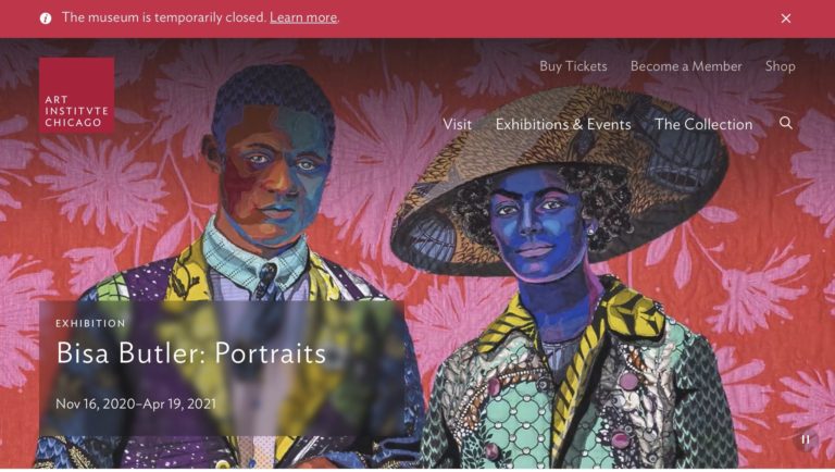
Art Institute of Chicago. The hero section features a slide show with a Ken Burns effect. The title of the featured exhibit has an transparency behind it so that it can be visible on a busy background.
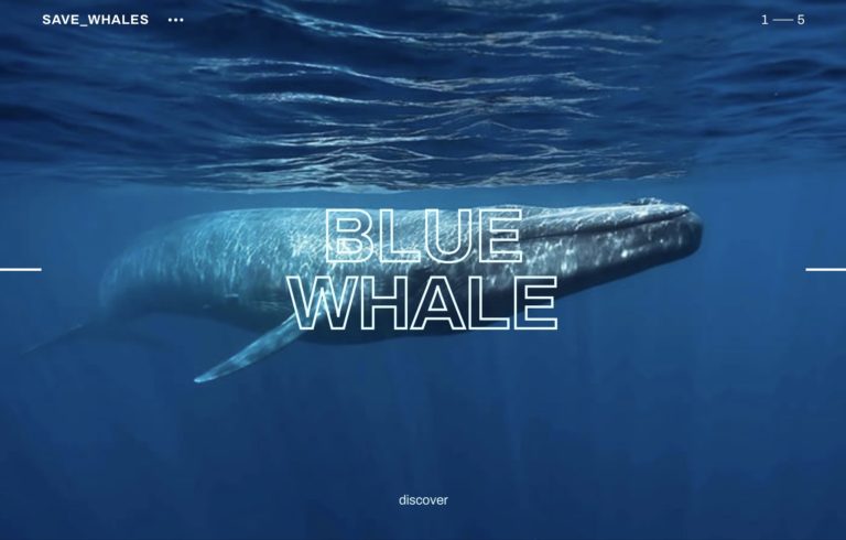
Large and legible typography that is easy to read is trending. A cause this worthy deserves a fantastic website. This one features not only great typography but an elliptical slideshow featuring endangered whales, along with stunning interactive graphics. Make sure you have the audio on to hear whale song and speech.
Created by Red Collar Digital Agency
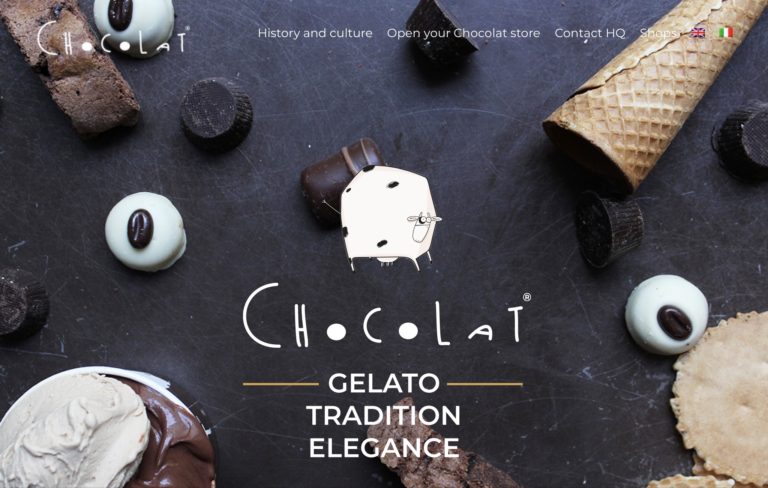
If cows could write they would probably use playful, eye-catching fonts like this.
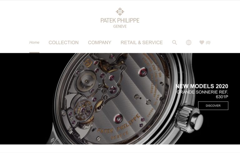
Understated, dull gold fonts in the menu area and a beautiful video featuring watches from all angles, makes for an elegant and ultra-chic website. The desktop experience is more comprehensive in terms of the art of watchmaking. The nearly black and white footage keeps the visuals from becoming overpowering or ostentatious.
On our Choosing the Best Color Palette page, I discussed generation preferences for certain colors. Are there generational preference for fonts as well? It turns out that there are preferences by generation. As you may have guessed, those generations that have grown up with the digital world since earliest childhood prefer sans-serif fonts.
Serif fonts were created to look good on the printed page. Therefore anyone growing up reading books, magazines and newspapers finds them comforting and familiar. Baby boomers, The Silent Generation, and Generation X feel at ease with serif fonts. Millennials and Generation Z have grown up knowing the digital world intimately and when they read, although they prefer video, they feel most at ease with san -serif fonts.
One thing to remember is to keep fonts legible and large enough to be seen. Boomers are vain and don’t ever want to be thought of as old. If you keep that in mind, you will succeed marketing to them.
Below are examples of serif and Sans – serif fonts
Times New Roman is the most familiar newspaper font.
Garamond is frequently used in print books.
Lora is a rule breaker. It is a serif font that appeals to lovers of Sans-serif fonts.
The old posters and signs in the Montserrat neighborhood of Buenos Aires inspired Julieta Ulanovsky’s design.
Is there a psychology behind fonts? Most definitely. Fonts can make or break logos or packaging design. They can also contribute to the overall look and feel of your website. What kinds of moods or styles can fonts denote? For example, various fonts can create the feeling of :
Let’s look at a few samples:
Business fonts are usually sans -serif no -nonsense fonts, such as:
Some examples below at 16px
Many years later, as he faced the firing squad, Colonel Aureliano Buendía was to remember that distant afternoon when his father took him to discover ice.
Many years later, as he faced the firing squad, Colonel Aureliano Buendía was to remember that distant afternoon when his father took him to discover ice.
Many years later, as he faced the firing squad, Colonel Aureliano Buendía was to remember that distant afternoon when his father took him to discover ice.
Many years later, as he faced the firing squad, Colonel Aureliano Buendía was to remember that distant afternoon when his father took him to discover ice.
Many years later, as he faced the firing squad, Colonel Aureliano Buendía was to remember that distant afternoon when his father took him to discover ice.
Many years later, as he faced the firing squad, Colonel Aureliano Buendía was to remember that distant afternoon when his father took him to discover ice.
Traditional fonts through their familiarity, can instill a sense of security and reliability. While all of the fonts below can be used in hero sections and headers, only Georgia and Tahoma should be used in the body of the text online. Notice how easy they are on the eye by comparison to Times New Roman and Garamond.
Lolita, light of my life, fire of my loins. My sin, my soul. Lo-lee-ta: the tip of the tongue taking a trip of three steps down the palate to tap, at three, on the teeth. Lo. Lee. Ta.
Lolita, light of my life, fire of my loins. My sin, my soul. Lo-lee-ta: the tip of the tongue taking a trip of three steps down the palate to tap, at three, on the teeth. Lo. Lee. Ta.
Lolita, light of my life, fire of my loins. My sin, my soul. Lo-lee-ta: the tip of the tongue taking a trip of three steps down the palate to tap, at three, on the teeth. Lo. Lee. Ta.
Lolita, light of my life, fire of my loins. My sin, my soul. Lo-lee-ta: the tip of the tongue taking a trip of three steps down the palate to tap, at three, on the teeth. Lo. Lee. Ta.
Elegant fonts will imitate script or cursive handwriting. They should be used decoratively, only. They look great in hero sections, when blown up to large size. I recently saw an example of Italianno used on a travel site for Venice and it was stunning.
Midway upon the journey of our life, I found myself within a forest dark, for the straightforward pathway had been lost.
Midway upon the journey of our life, I found myself within a forest dark, for the straightforward pathway had been lost.
Midway upon the journey of our life, I found myself within a forest dark, for the straightforward pathway had been lost.
Midway upon the journey of our life, I found myself within a forest dark, for the straightforward pathway had been lost.
Creative fonts work well with creative websites or the websites of creatives. Again, not to be used in extensive sections but decoratively.
a way a lone a last a loved a long the / riverrun, past Eve and Adam’s, from swerve of shore to bend of bay, brings us by a commodius vicus of recirculation back to Howth Castle and Environs.
a way a lone a last a loved a long the / riverrun, past Eve and Adam’s, from swerve of shore to bend of bay, brings us by a commodius vicus of recirculation back to Howth Castle and Environs.
a way a lone a last a loved a long the / riverrun, past Eve and Adam’s, from swerve of shore to bend of bay, brings us by a commodius vicus of recirculation back to Howth Castle and Environs.
a way a lone a last a loved a long the / riverrun, past Eve and Adam’s, from swerve of shore to bend of bay, brings us by a commodius vicus of recirculation back to Howth Castle and Environs.
Futuristic Fonts should only be used in headings, headers, and short passages:
Man has gone out to explore other worlds and other civilizations without having explored his own labyrinth of dark passages and secret chambers, and without finding what lies behind doorways that he himself has sealed.
Man has gone out to explore other worlds and other civilizations without having explored his own labyrinth of dark passages and secret chambers, and without finding what lies behind doorways that he himself has sealed.
Man has gone out to explore other worlds and other civilizations without having explored his own labyrinth of dark passages and secret chambers, and without finding what lies behind doorways that he himself has sealed.
Man has gone out to explore other worlds and other civilizations without having explored his own labyrinth of dark passages and secret chambers, and without finding what lies behind doorways that he himself has sealed.
Hipster Fonts are decorative as well:
I was surprised, as always, by how easy the act of leaving was, and how good it felt. The world was suddenly rich with possibility.
I was surprised, as always, by how easy the act of leaving was, and how good it felt. The world was suddenly rich with possibility.
I was surprised, as always, by how easy the act of leaving was, and how good it felt. The world was suddenly rich with possibility.
I was surprised, as always, by how easy the act of leaving was, and how good it felt. The world was suddenly rich with possibility.
There are fonts that you should stay away from and some have been so overused, like Lobster, that they are hated despite their beauty.
You have to make use of your white space to create a clean, uncluttered, readable look. How can you achive that?
Fonts should be properly sized, weighted and spaced for maximum legibility. Your website should be a pleasure to look at and easy to read.
Google says that in the early 2000s, heading elements (H1, H2, H3) were ranking factors. It was mandatory to add your keywords in the headings if you wanted to rank. But that’s not been the case for many years. Instead Google reads headings in order to understand what the topic of the paragraphs that follow the heading are about. Just nest the sizes from most important H1 to least important H6 for the purposes of aesthetic continuity. You do not need to use all 6. I use H1 for the title of the page or post, H2 in the paragraph headings and H3 in the body of the text if I am adding an important subtopic.
Color, contrast, and responsive design must be considered when designing a website. For example:
Is there a font you have seen that you really love but aren’t sure what it is? You can discover fonts a couple of ways:
To see sample of Google fonts in a paragraph you can go to Google Fonts.
Google Fonts also suggest font pairings. Test them out before committing to them on your website.
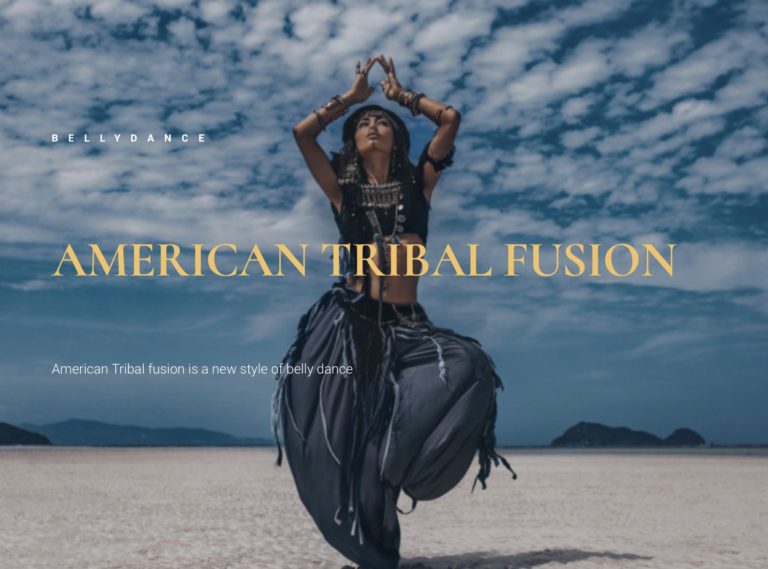
A tribal belly dancing site, featuring instructional videos, a calendar of scheduled performances, biography, video performances, and photos of the dancers. Your research indicates that the ideal user going to be: a woman, artistic, in the 18 -54 age range.
Which fonts will you use on the hero section, the headers and the body of the text?
I think Cormorant looks good in the hero section. I would pair it with Lato or Quicksand in the body of the text. This is Lato.
And this is Quicksand, which is pretty as well.
A medical website that is inviting but not overly sterile. This type of image could function in almost any section for almost any practice. The image is warm and welcoming, despite the blue and grey tones.
You can use almost any Sans Serif font. The goal is to make the text legible and the website easy to use.
I used Libre Baskerville across the image.
Helvetica is super easy to read, especially for older people. I used it in the text.
A mechanic / body shop specializing in maintaining restoring sports cars. For this website, I used a slider featuring the owner and employees in the hero section. This is a rendition of the About section, that appeared midway down the Home page. I used Jura in the About Us header and Roboto Slab in the body of the text.
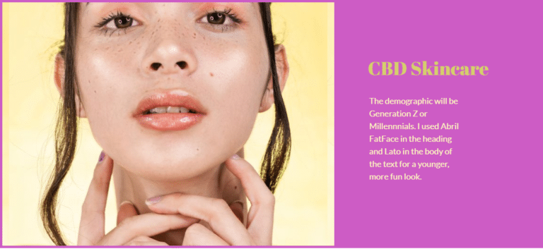
Let’s look at two different demographics for skin care products. One is older and affluent. The other is young and hip. These could function as sections anywhere on a page.
Playfair Display looks great on luxury websites aimed at women.
I used Alegreya Sans in the body of the text and Tangerine across the image.
Abril Fatface is young and fun.
I used Lato in the body of the text. It pairs well with Abril Fatface.
Let’s summarize everything we have learned:
Fonts can enhance your business and your website. Use them to your best advantage and with thoughtful preparation for best results.