Create an author website that kicks ass in 2022
As an author, you need a website to establish your credibility, sell your books, and build your email list. Your website is one of your greatest marketing tools. Learn what to put on your website for maximum results.
As an author, your website is one of your most powerful marketing tools. Whether you are going to build your website yourself or hire a designer, you should be familiar with the elements that go into creating a bad ass website that will appeal to your readers.
- What should I know before I create an author website?
- What is the first step I should take before starting my author website?
- Start planning your pages
- Plan what you will put on each page
- Page organization
- Other important features to include on your website:
- How do I choose a website designer?
- I cant afford to hire anyone to design my author website. What should I do?
- I'm scared of WordPress, is there any other page builder I could use to make my author website?
- How will I design the pages of my author website?
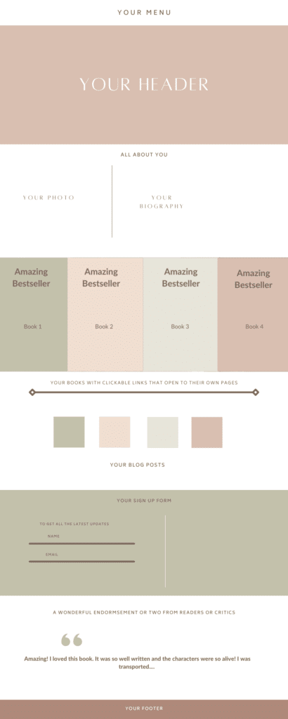
- A template you can follow for creating your author website home page
- Summary
What should I know before I create an author website?
The first step you will take when you create an author website is to consider your branding. If you are self publishing, you will want to make sure that your cover art and associated fonts, images and colors reflect your genre clearly. Furthermore, you will want to draw readers in with your cover designs and make them want to crack open those covers.
Your website should support your books and branding. The look, feel, fonts, copy of your website shouldn’t be fighting or competing with your book covers. Rather, your website pages should be visually aligned with your books.
What is the first step I should take before starting my author website?
Do some research. Google other authors within your genre. See what is or isn’t working on their pages. For example:
- Do their websites look outdated?
- Are their books crammed onto the page?
- Is there too much information on the page?
- Is the site easy to navigate and are the pages easily accessible from the menu?
- Are you able to follow the sales funnel down the page?
- Are the call to action buttons clearly labeled, accessible and lead you to take the next right action?
- Do all the links to online bookstores work properly?
- Do you have a clear sense of which genre the author is working in?
- Does the site function well across all devices?
- Are the pages fast loading?
Make a list of the features you really love and think you should include on your website.
Start planning your pages
Think about the pages you want to include on your website. For example:
- Home Page
- New releases page
- About Page
- Book Page – I suggest a page for each book in your subpages. It will be great for your SEO.
- Contact page or form
- Upcoming events
- Sign up form to capture readers’ emails
- Testimonials from readers
- Professional reviews
- Blog
- Links to your social media
Plan what you will put on each page
Remember Sesame Street? One of these things doesn’t belong here- can you guess which one? Group things that go together logically.
- Home page – This is where you will make clear immediately who you are and what you write about. Some authors place their new releases on their home page and an order now or order in advance call to action button.
- About page – this is where you will write a reader friendly biography. Your goal is to connect with your readers. Tell them your story, what inspires you to write, where you get your ideas, how you got started. Share your challenges and victories with them. Don’t be shy. They want to know all about the creator of their favorite books. Include a clear, professional headshot so that your readers can get a good sense of who you are.
- New releases page – a dedicated page for your latest release, or upcoming release. You want to drum up interest, so include an exciting description of the book, the cover, excerpts, advance reader praise and a button that will link to Amazon or wherever you sell your books online.
- Book Pages – each book should have its own dedicated page that includes all the necessary information: description, excerpt, cover, reviews, and links to online bookstores where you sell your books. If you are writing a series, or if you write similar books, place those covers with links to their own dedicated pages at the bottom of the page. For example, if you liked ( insert title) then read ( insert title). Include relevant videos on those pages.
- Sign up Form – this is an important feature to include. You can build your email list, that is all the people you will send your newsletter to, by offering them discounts, special deals, updates on new releases, excerpts of upcoming books and the like. I use Mailchimp, but my clients use Mad Mimi, I-contact and other email services. Google to see what is best for your budget. Each of those services will give you specific instructions to connecting your sign up form to your list.
Page organization
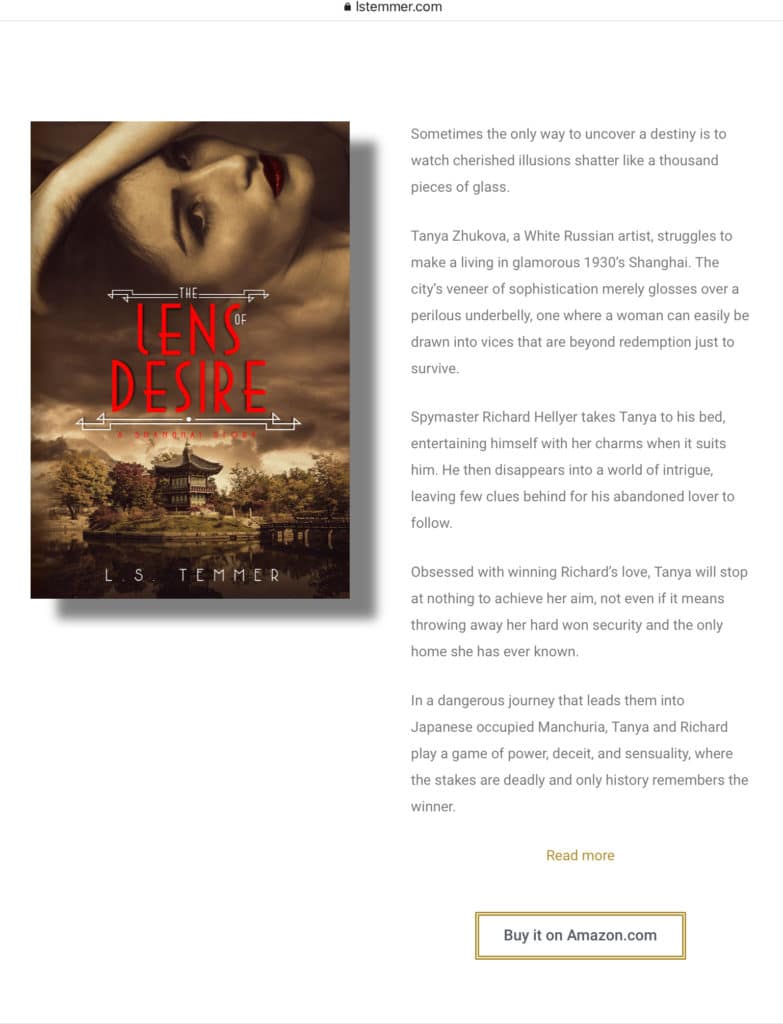
If you would like to see how I organize my own book pages, please click on the link LSTemmerBooks.
Other important features to include on your website:
- Reader reviews – put them on the corresponding book page
- Professional reviews – ditto
- Excerpts – people want to read excerpts, don’t make them go off page to your online book store in order to do that.
- Events – tell your readers about any launch parties, readings, book signings, and appearances you will be making
- Social proof – are you a best selling author; have you won any prizes? Put that on your home page.
- Contact forms – do you want readers to be able to contact you? if so, include a contact form.
- Links to your social media pages
- Your blog – keep your readers entertained and informed. Tell them about your research, your writing schedule, give them excerpts from upcoming books, engage them in a conversation and involve them in decision making- for example, which cover do they prefer?
How do I choose a website designer?
Choose someone with experience and who understands the book marketing process.
I cant afford to hire anyone to design my author website. What should I do?
Don’t worry. The process is very simple. I suggest using WordPress, the most versatile platform on the market. If you install a page builder, like Elementor, you can simply drag and drop elements and not worry about coding. Please follow the directions on our How to make a WordPress Website page step by step. It is easy, failsafe, and I promise you that you will be able to do it.
I’m scared of WordPress, is there any other page builder I could use to make my author website?
Don’t be scared! Everything is fixable and easy once you get the hang of it. You could also use Wix author templates or you can adapt a template from Squarespace. Personally, I prefer WordPress for its versatility, power, and incredible SEO capabilities. Squarespace can get pricey and doesn’t have the SEO capability of WordPress. Wix SEO capability has improved but its templates are limited and you might end up with a website that is too similar to another author’s.
How will I design the pages of my author website?
Your website pages are there to support your books. The design has to harmonize with your covers. Furthermore, it should draw the reader in. Let’s look at some examples:
Romance
There is no doubt whatsoever what is on offer here. You know right away that she is a New York Times bestselling romance author. Interestingly, Sarah has her own podcast and a dedicated page for it. She also sells romance gear -t-shirts , hoodies, bags and mugs with clever sayings.

Children’s Books
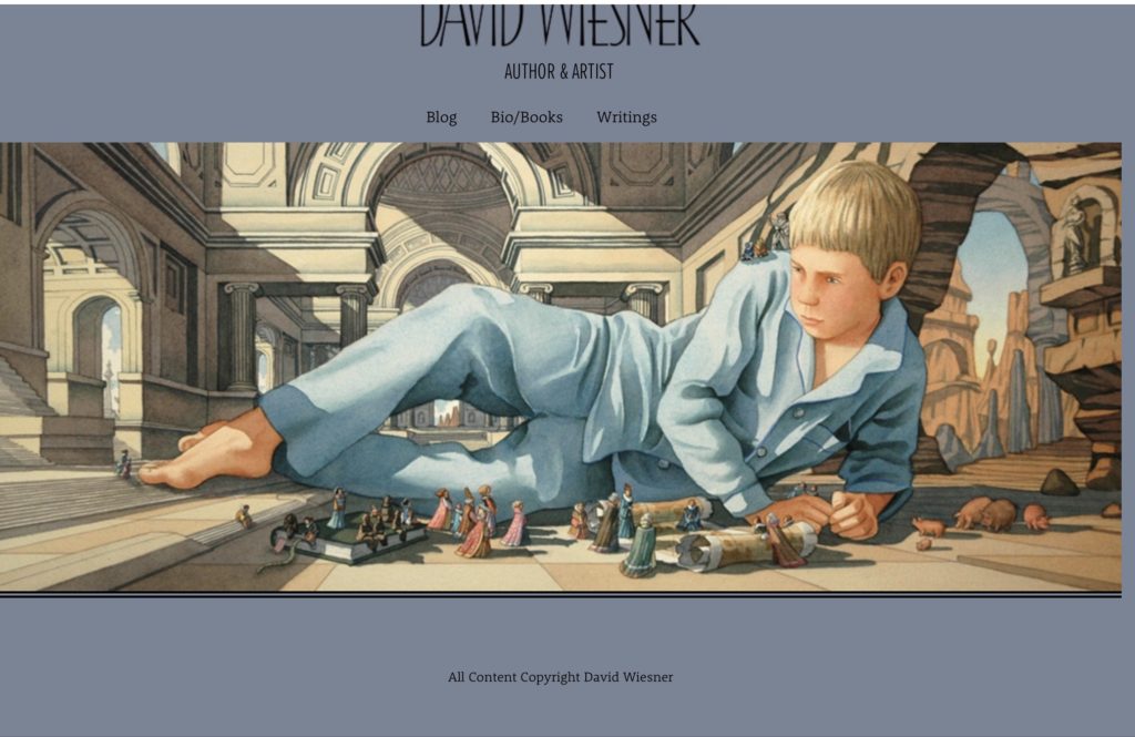
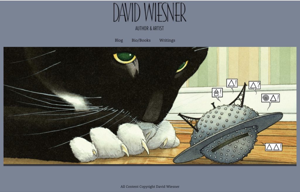
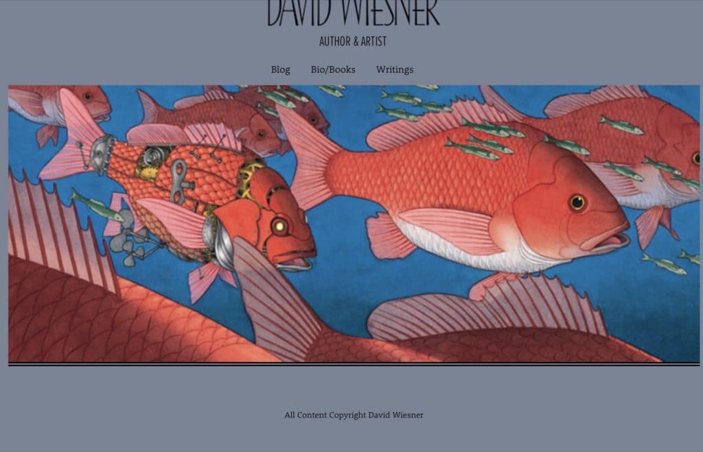
This is David Wiesner’s site. David is an author and an artist. The header on his home page features a slideshow with his gorgeous artwork. The art is so magical that it makes me want to buy all his books immediately. His bio/books tab opens to multiple pages that discuss his creative process, books, and more. You can easily create a slideshow in your header on your website.
Individualistic
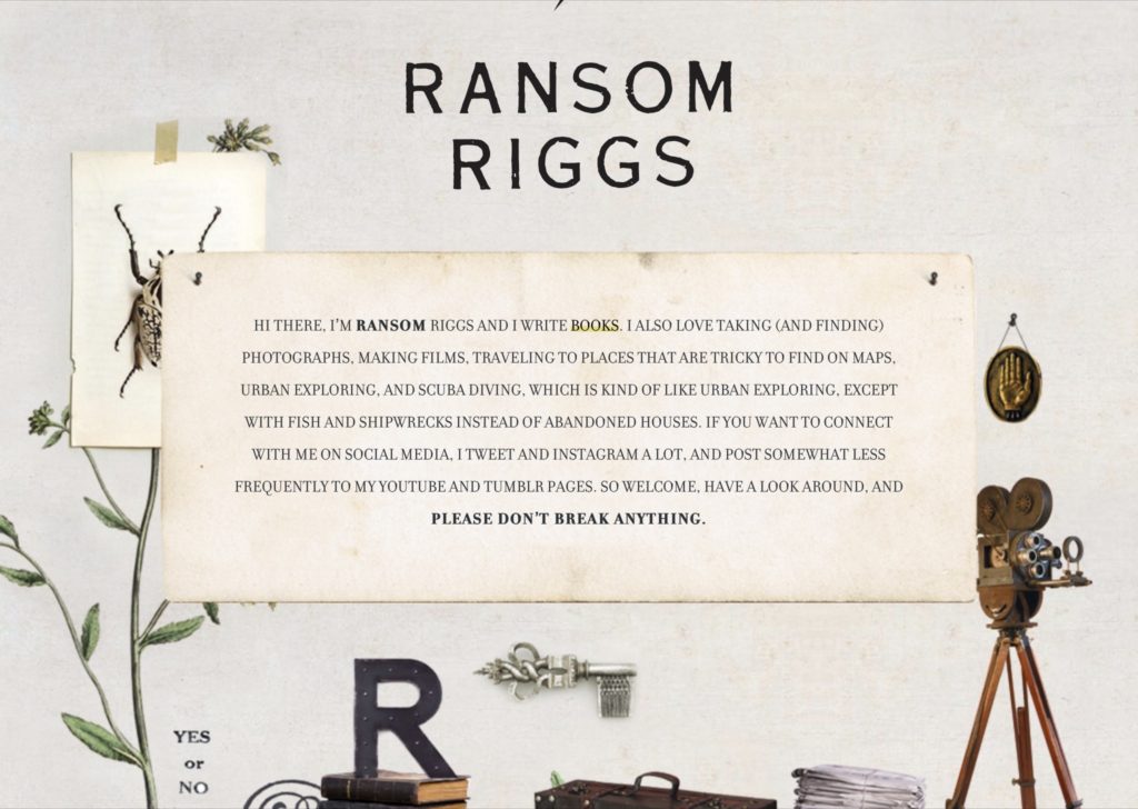
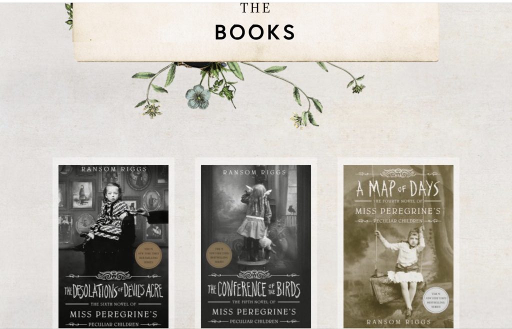
I’ll use this as an example of outstanding branding. Notice how the home page supports and harmonizes with the book covers. Ransom Riggs is a photographer and a writer.
Fantasy
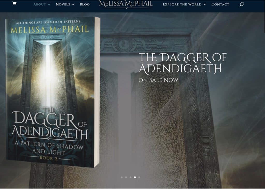
Melissa McPhail writes fantasy. Her website home page looks like an alternate universe – one where the reader wants to spend his or her time! The header features a slideshow with backgrounds that correspond to the various book covers on display. The entire website, which includes maps and other materials which enhance her world building is a must see. This site was built with Divi.
Historical mystery
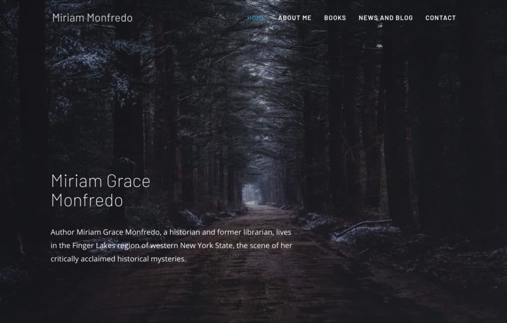
Miriam Monfredo’s header consists of a seemingly simple photograph. However, it signifies so much to the reader: mystery, moodiness, fear, dread, cold and the feeling of being lost in a dark wood, with a light at the end of the tunnel. Below the header is a fantastic photo of Miriam, along with her biography. Below that is a slider of all her books, and below that a fantastic review from a reader.
Young Adult
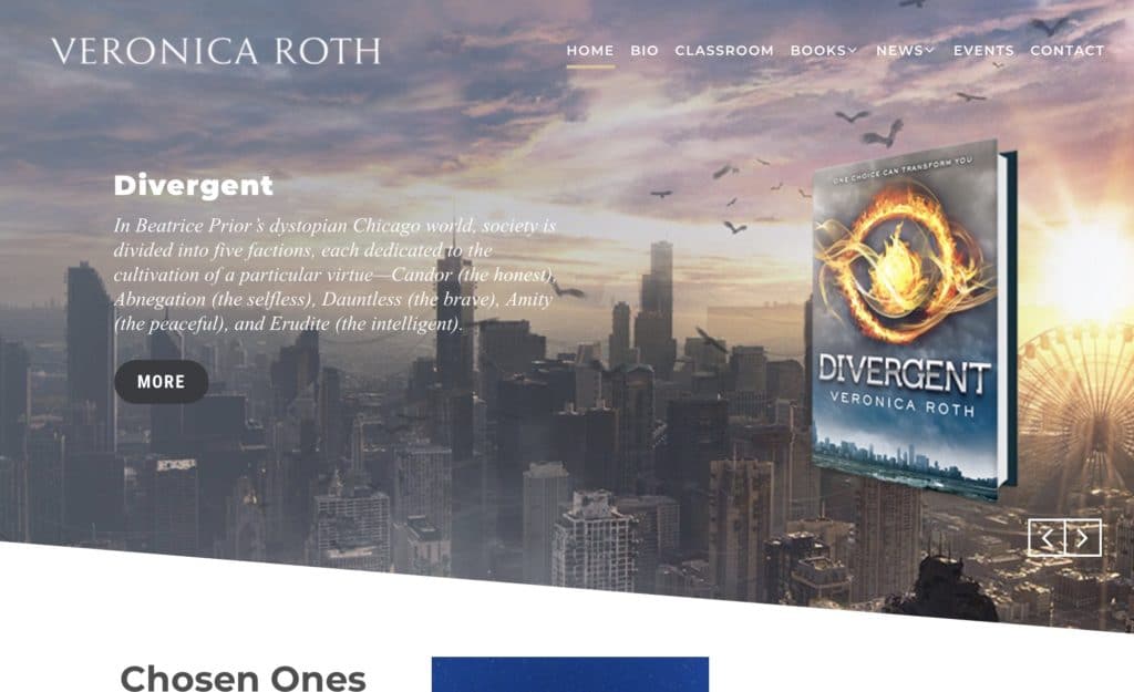
Veronica Roth, author of the best selling Divergent series has a beautifully minimalistic website with an off center slider. Veronica introduces her new release, Chosen Ones, directly beneath the header.
Thriller
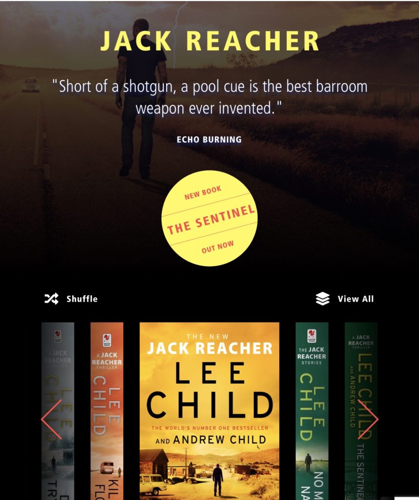
When you are so famous that even your characters have websites! Lee and Andrew Child. Moody and atmospheric.
Science Fiction
This site features an amazing video teaser in the header that that leaves the viewer wanting to read more. Karen Osborn.

Non-fiction
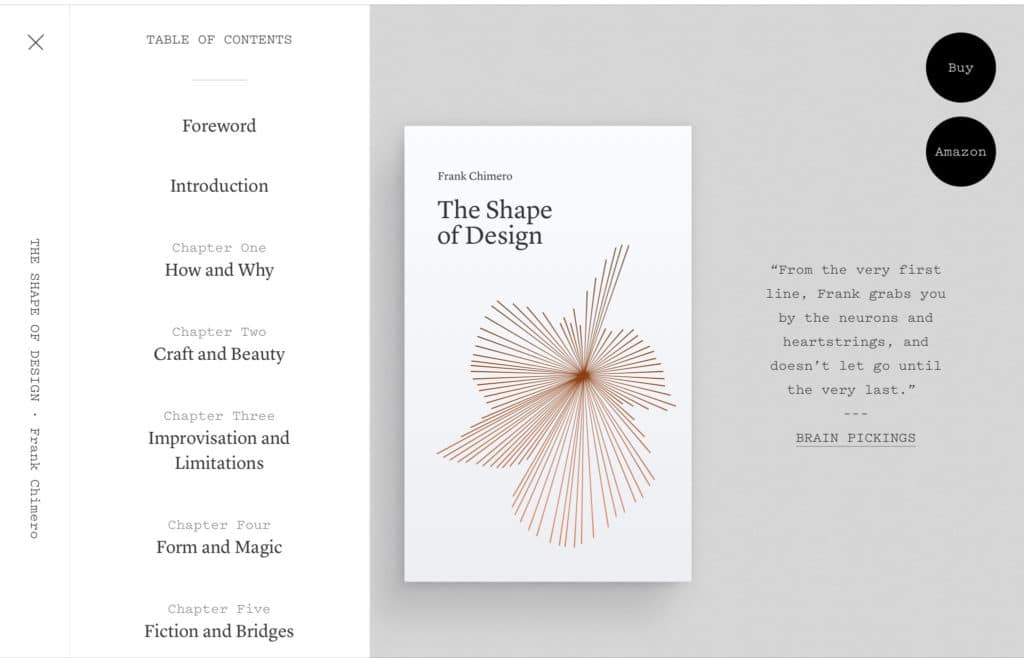
Lovely with a beautiful side menu that opens to a particular chapter in the book. This book has its own website, The Shape of Design, but the author also links to it from his landing page Frank Chimero.
A template you can follow for creating your author website home page
Summary
Before starting your author website, you must do the following:
- Research other author websites for inspiration
- Remember your website is there to enhance the look of your already branded books. The design should harmonize with your book genre
- Decide on the pages and features you will include on your website
- Hire a website designer who understands the book business
- Do it yourself. To learn about branding START HERE.
- To learn how to build a WordPress website step by step CLICK HERE. You will learn everything from finding the best host to choosing a domain name, setting up your pages, to all the themes, plugins and page builders you will need in easy to understand terms.
- You can use a drag and drop page builder like Elementor or a template from the Astra theme library. To read more about Elementor and Astra, click here.
- To get great SEO please read my blog post on the RankMath SEO plugin.
If you would like me to design and build your website, please use the contact form on this website or visit me at my company site Alt Media Chicago.
